Flexbox Froggy
Note: Everything in this document is based off the Flexbox Froggy game, a website dedicated to helping newcomers to the flexible box model in CSS. As loosely stated on the Flexbox Froggy website:
Flexbox Froggy is a game where you help Froggy and friends reach their lilypads by writing CSS code using flexbox!
Goal of game: As noted above, the goal of the game is to always move the frog(s) to their similarly colored lilypad(s).
Flexbox: Jump to the flexbox properties and values section to review some of the commonly used properties and values available when using the flexible box model in CSS.
Levels: Get started by jumping to the levels section to find your desired level.
Usage: For any given level, you are provided with a screen capture of what the beginning of that level looks like.
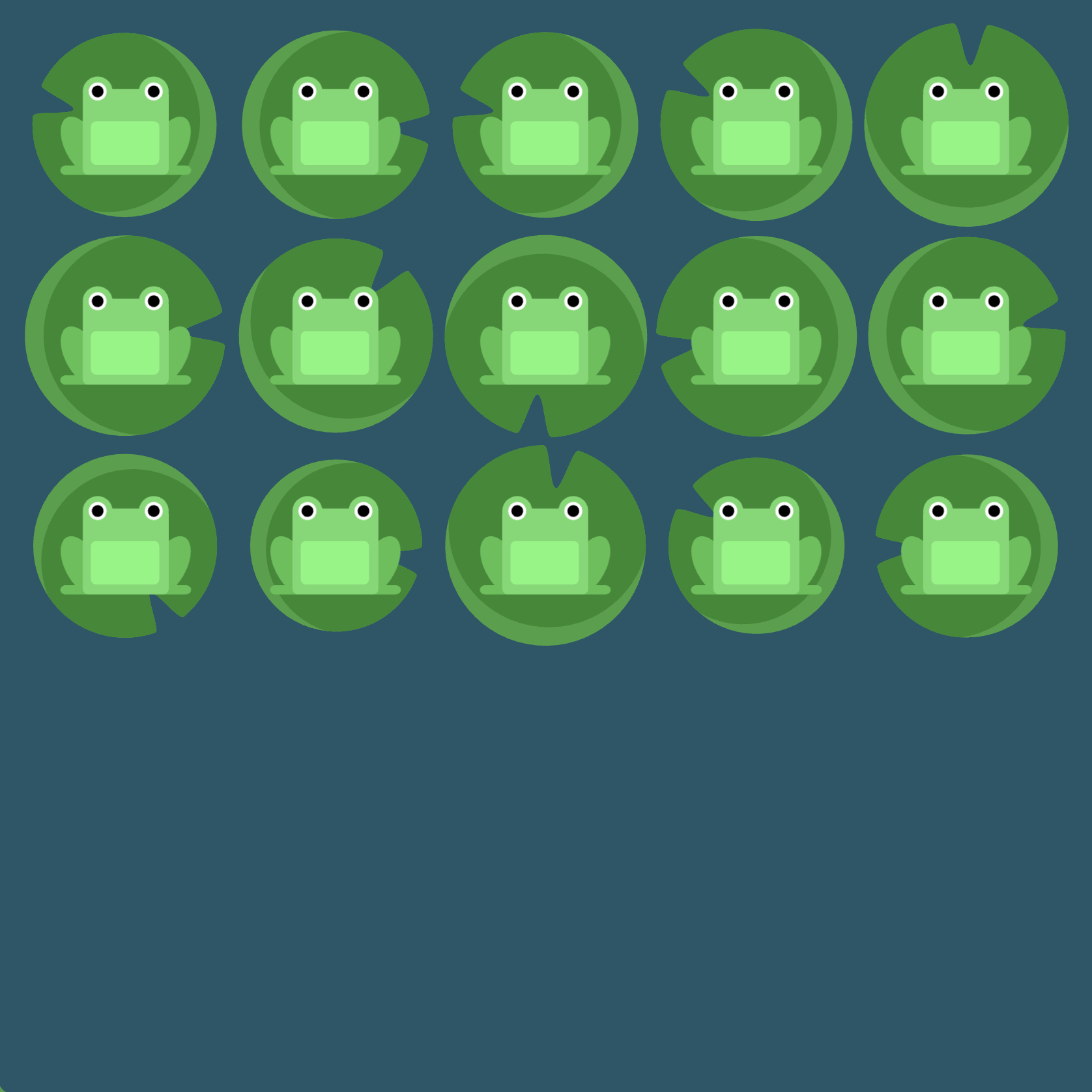
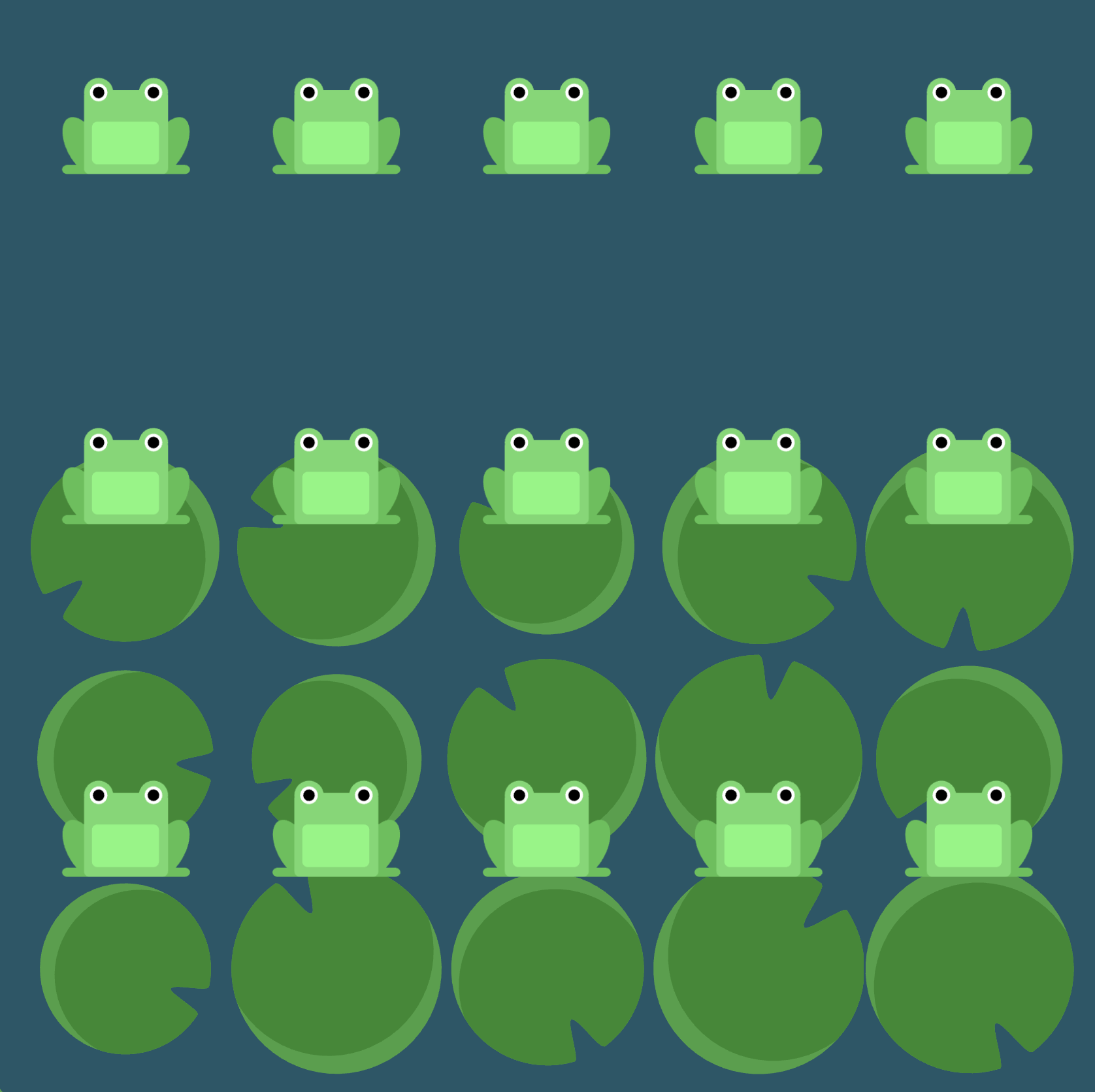
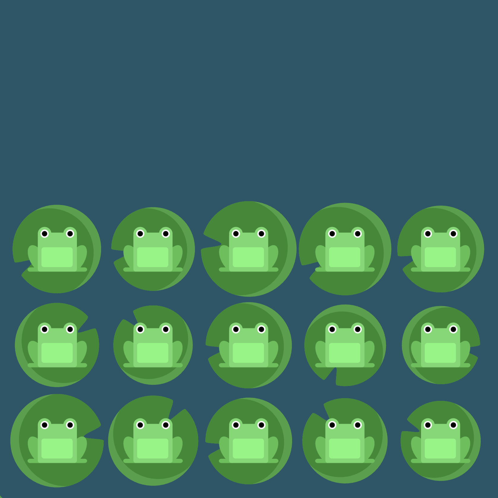
- Observe picture: First take note of the positioning of the frogs from the screen capture--you know your goal is to always move the frogs onto their similarly colored lilypads.
- Given code: You are given a certain amount of code. Your job is to deduce what additional code you need to provide on the allotted lines (marked by
/* your work here */) to get the frogs to their desired destination. - Hints: Click the
Click here for more explicit direction (i.e., hints)if you need a nudge in the right direction. What you find will most often be a reference to something you can find in the flexbox properties and values section. - Solution: Underneath the screen capture for each level you may click
Solutionto see one possible solution. You will also see, when relevant, what each line of code does via additional screenshots.
Flexbox Properties and Values
justify-content
The justify-content property aligns flex items along the main axis (horizontal by default) and takes the following values:
flex-start: Items align to the start (left by default) of the container.flex-end: Items align to the end of the container (right by default).center: Items align at the center of the container.space-between: Items display with equal spacing between them.space-around: Items display with equal spacing around them.
Note: justify-content: flex-start could right-align items if flex-direction: row-reverse has been used previously for the same flex container.
align-items
The align-items property aligns items along the cross axis (vertical axis by default) and takes the following values:
flex-start: Items align to the start of the container (top by default).flex-end: Items align to the end of the container (bottom by default).center: Items align to the center of the container (vertical center by default).baseline: Items display at the baseline of the container.stretch: Items are stretched to fit the container.
flex-direction
Defines the direction of the main axis (horizontal by default) or, more simply, the direction in which items are placed in the container.
row: Items are placed the same as the text direction (left to right by default).row-reverse: Items are placed opposite to the text direction (i.e., right to left).column: Items are placed top to bottom (left to right by default).column-reverse: Items are placed bottom to top.
order
Specifies the order of the flex item.
<integer> (..., -1, 0, 1, ...)(0 by default)
Sometimes simply reversing the row or column order of a container is not enough. In these cases, we can apply the order property to individual items. By default, items have a value of 0, but we can use this property to also set it to a positive or negative integer value (..., -2, -1, 0, 1, 2, ...).
align-self
Aligns an individual or specific flex item (singular) along the cross axis, overriding whatever align-items value may exist for this item. Hence, the align-self property takes all the same values (and singular effects) that align-items does:
flex-start: Specific item aligns to the start of the container (top by default).flex-end: Specific item aligns to the end of the container (bottom by default).center: Specific item aligns to the center of the container (vertical center by default).baseline: Specific item displays at the baseline of the container.stretch: Specific item is stretched to fit the container.
flex-wrap
Specifies whether flex items are forced on a single line or can be wrapped on multiple lines.
nowrap: Every item is fit to a single line.wrap: Items wrap around to additional lines.wrap-reverse: Items wrap around to additional lines in reverse.
flex-flow
The two properties flex-direction and flex-wrap are used so often together that the shorthand property flex-flow was created to combine them. This shorthand property accepts the value of one of the two properties separated by a space. For example, you can use flex-flow: row wrap to set rows and wrap them. Also, for the previous exercise, instead of using flex-direction: column and flex-wrap: wrap together, we could have simply used flex-flow by itself in the following manner: flex-flow: column wrap.
More concisely, we see that flex-flow is just a shorthand property for flex-direction and flex-wrap:
flex-flow: <flex-direction> <flex-wrap>
align-content
The align-content property can be used to set how multiple lines are spaced apart from each other (relevant when there is extra space between items along the cross-axis). This property takes the following values:
flex-start: Lines are packed at the top of the container.flex-end: Lines are packed at the bottom of the container.center: Lines are packed at the vertical center of the container.space-between: Lines display with equal spacing between them.space-around: Lines display with equal spacing around them.stretch: Lines are stretched to fit the container.
Note that align-content determines the spacing between lines while align-items determines how the items as a whole are aligned within the container. When there is only one line, align-content has no effect.
Levels
- Level 1
- Level 2
- Level 3
- Level 4
- Level 5
- Level 6
- Level 7
- Level 8
- Level 9
- Level 10
- Level 11
- Level 12
- Level 13
- Level 14
- Level 15
- Level 16
- Level 17
- Level 18
- Level 19
- Level 20
- Level 21
- Level 22
- Level 23
- Level 24
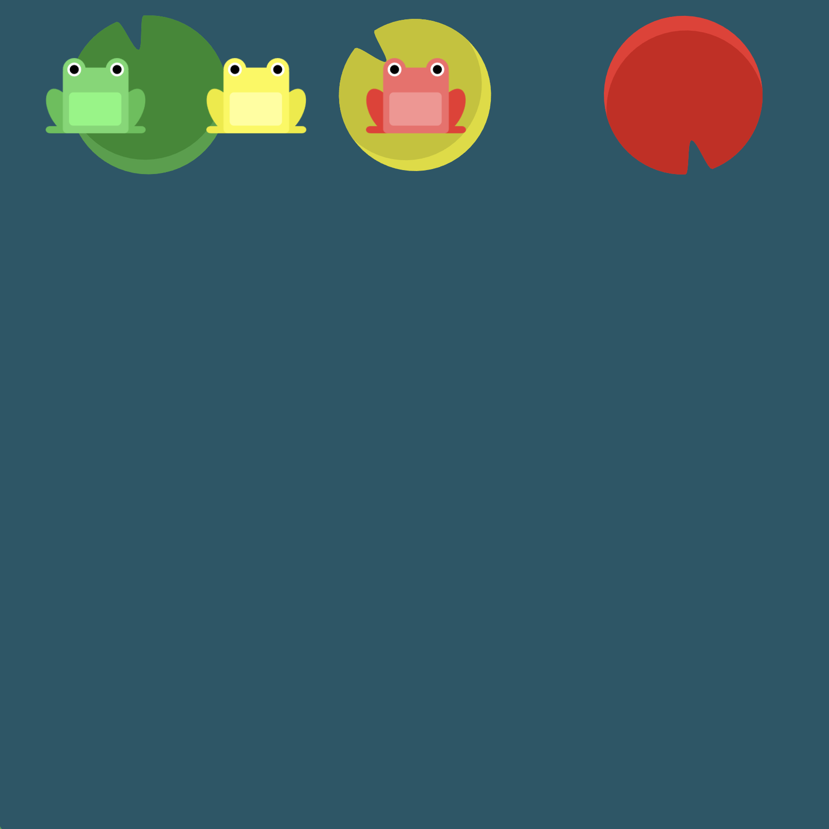
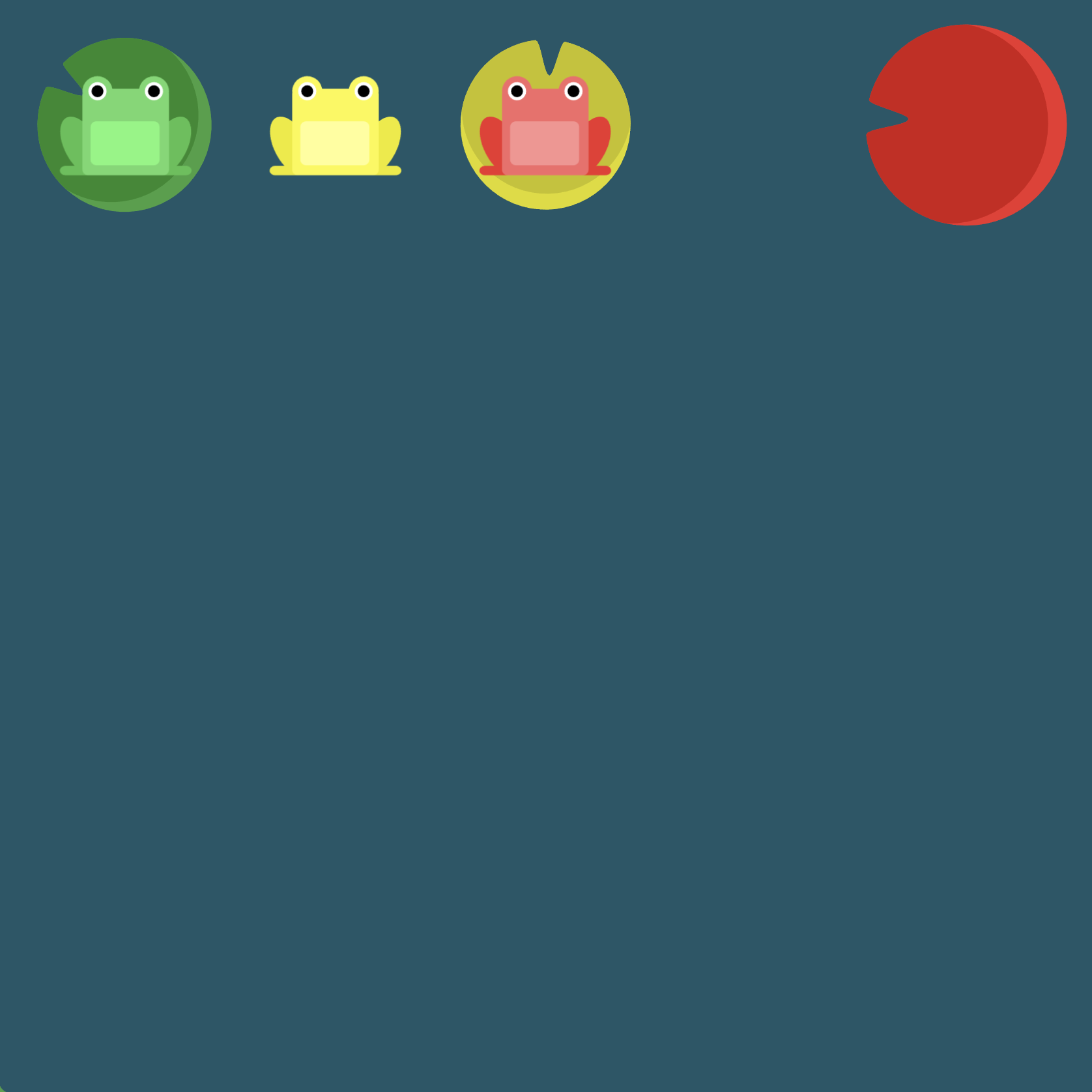
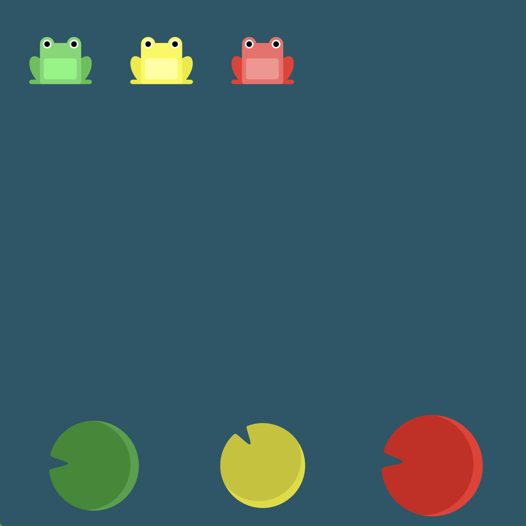
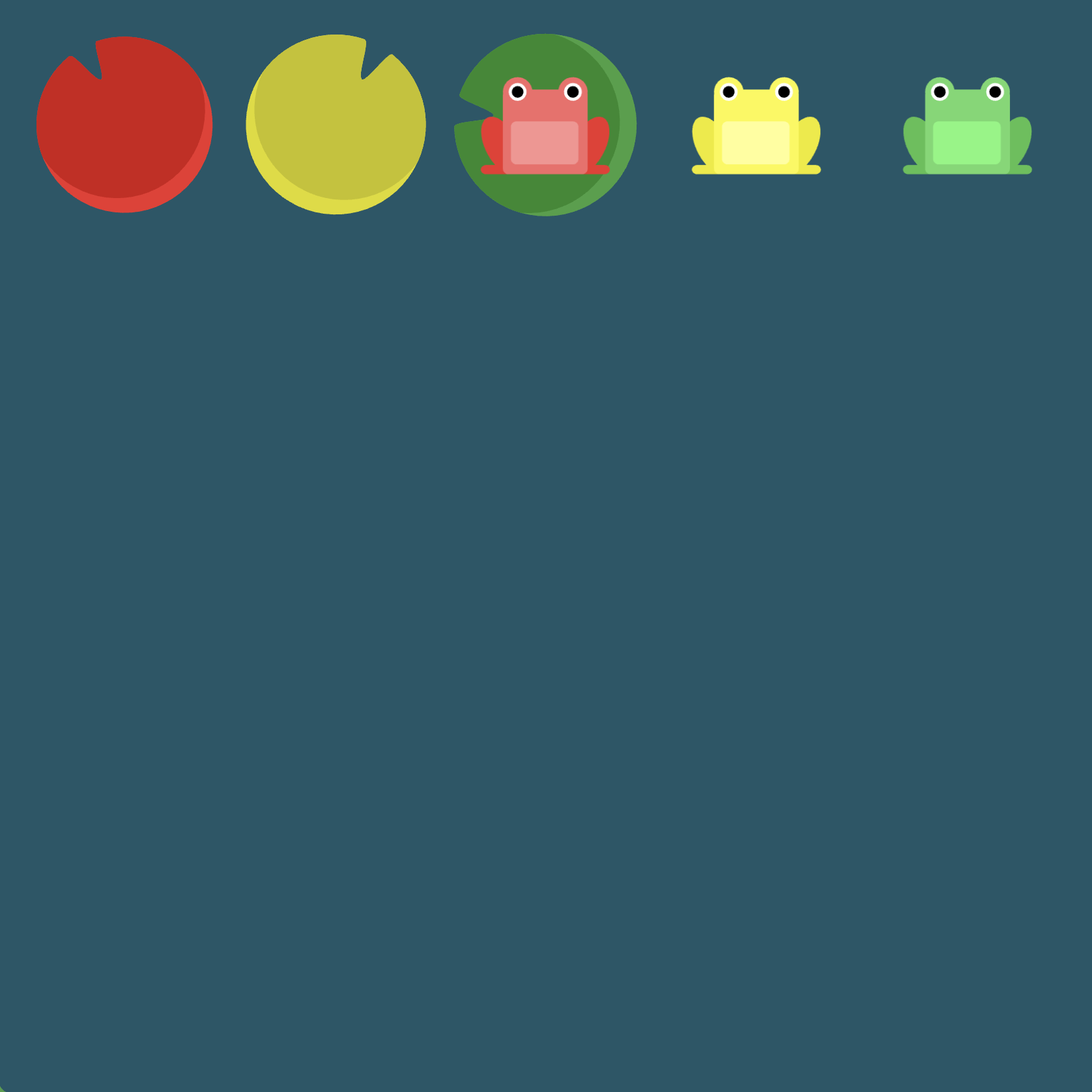
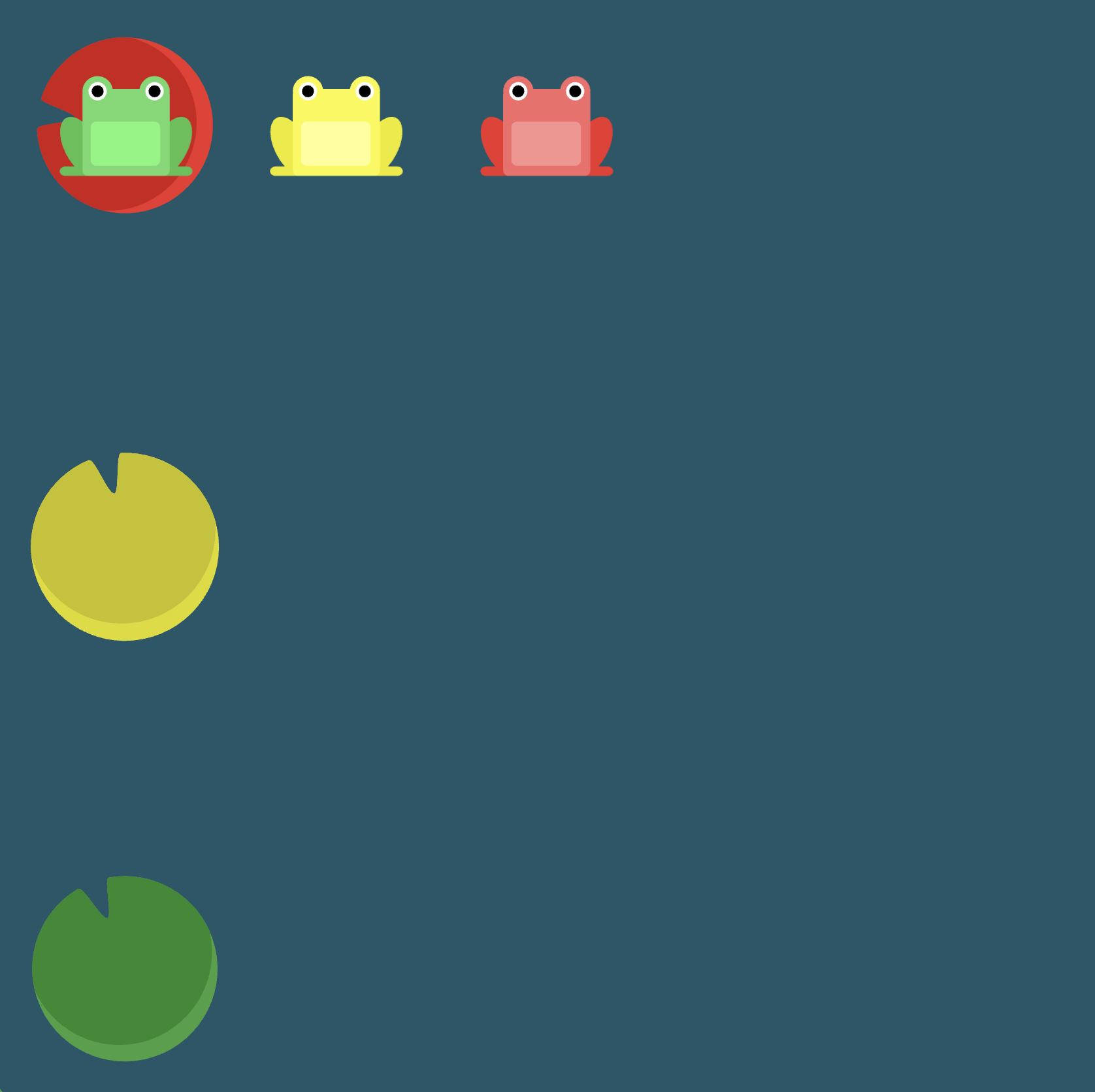
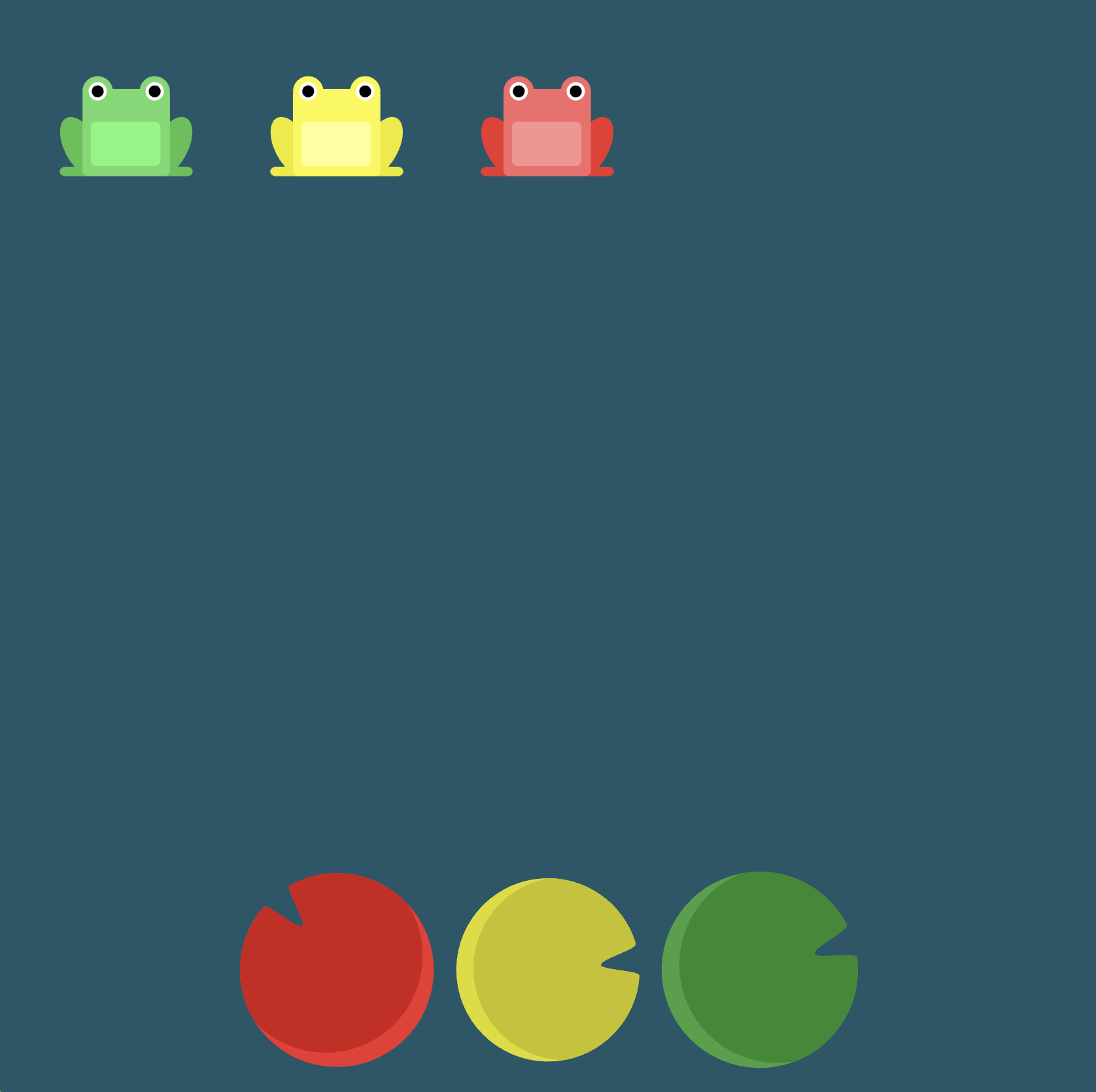
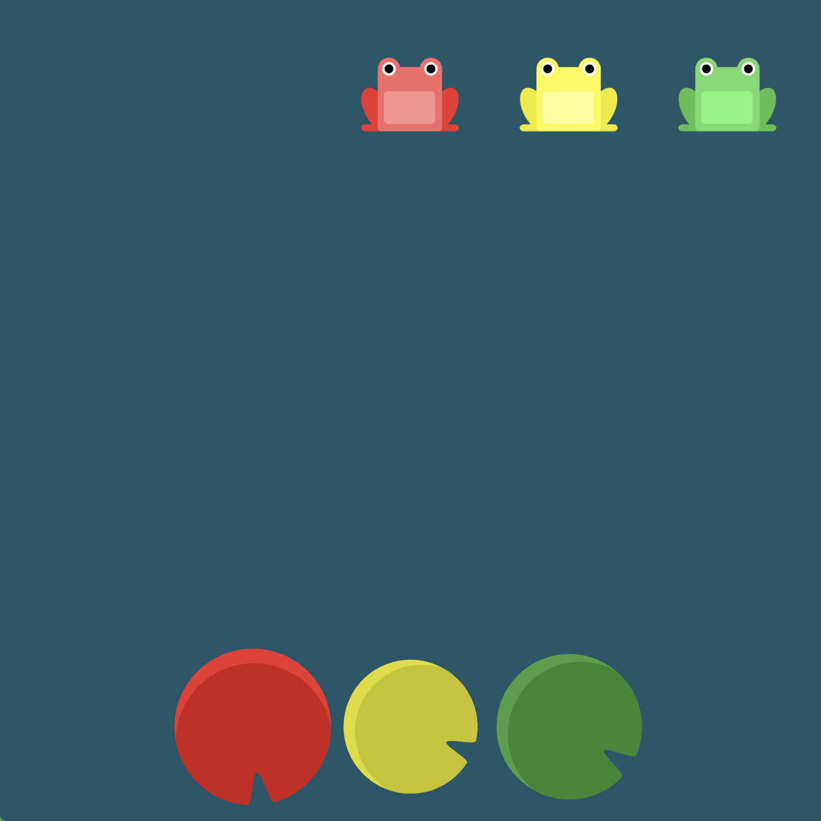
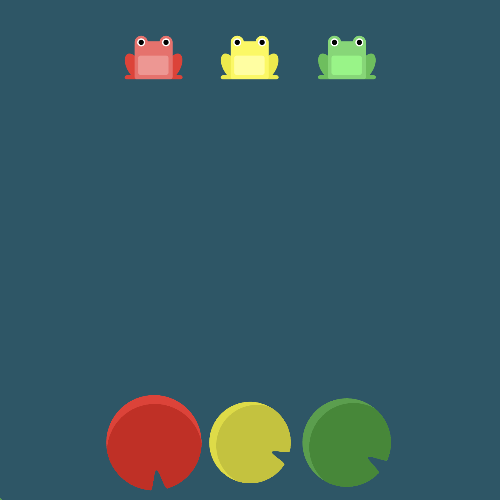
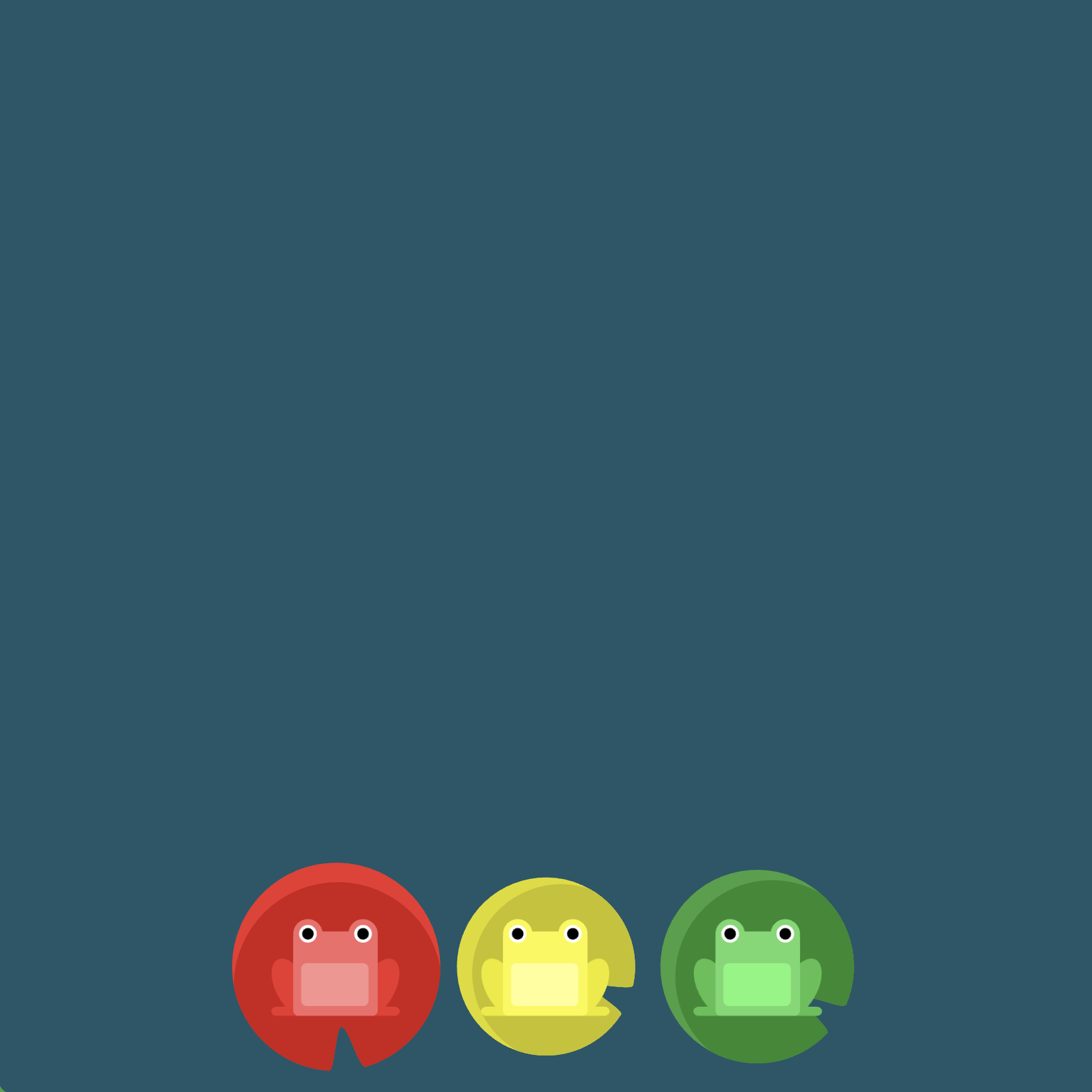
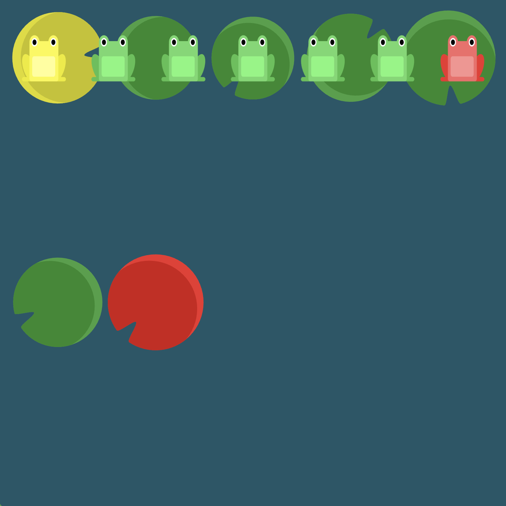
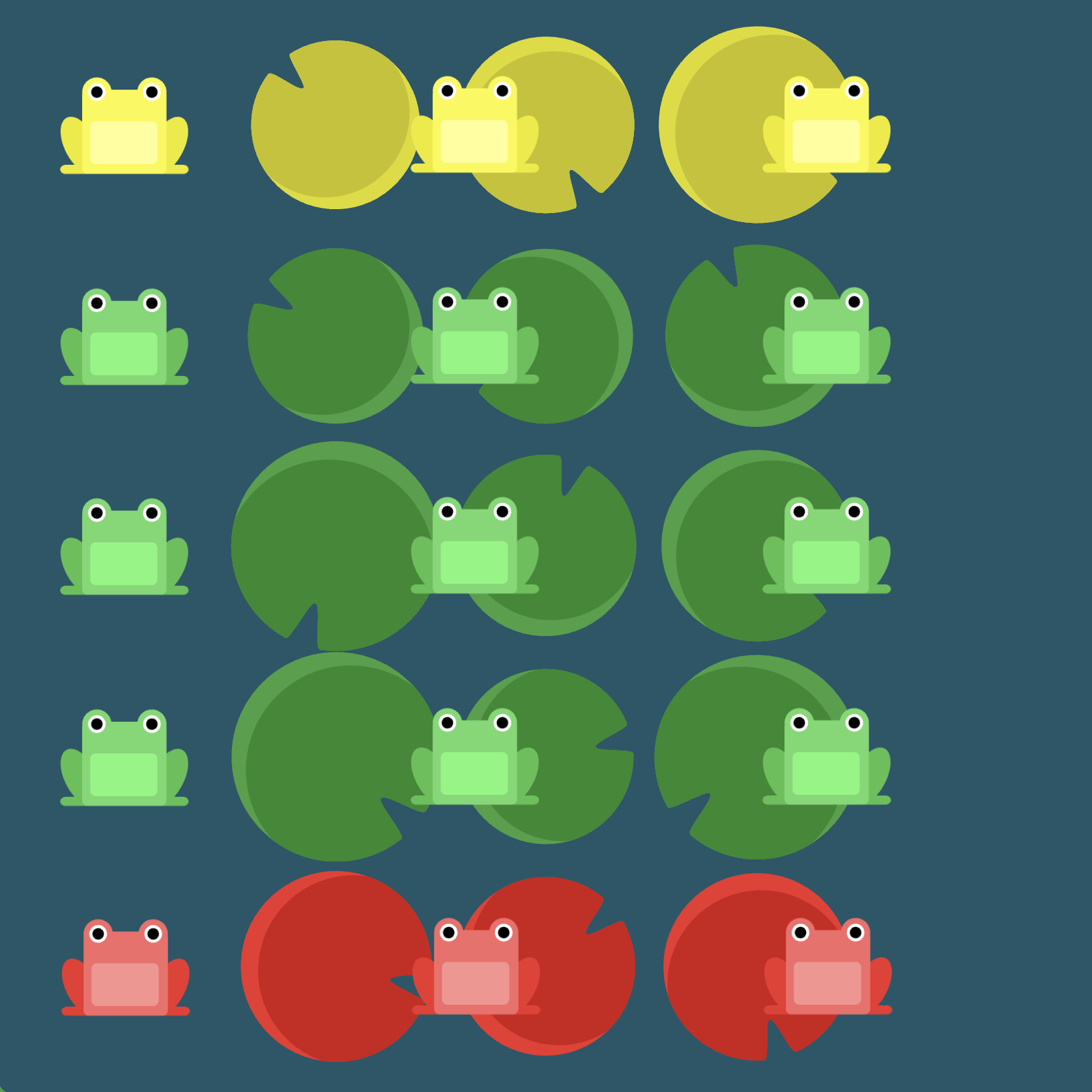
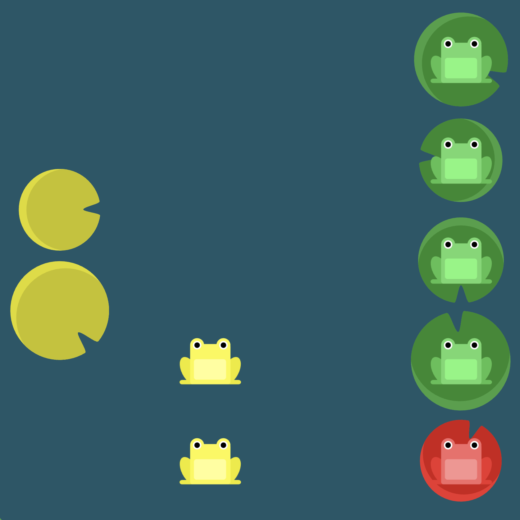
Level 1
Click here for more explicit directions (i.e., hints)
The following are possible approaches:
justify-content: flex-end: This will move the frog to the end of the container to the right.flex-direction: row-reverse: This will change the default starting position of the row from left to right.

(See the flexbox properties and values for reference.)
/* given code */
#pond {
    display: flex;
                                            /* your work here */
    /* only use blank line above */
}
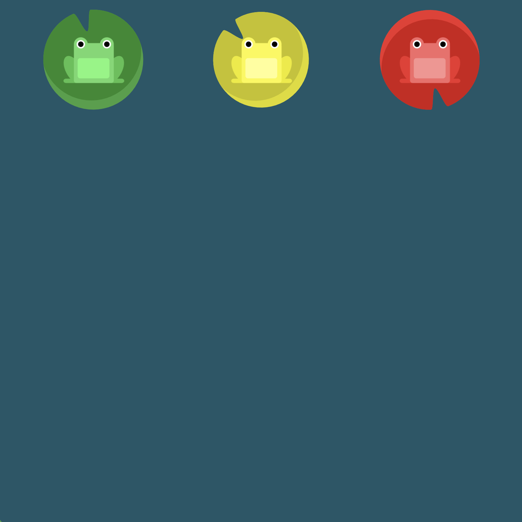
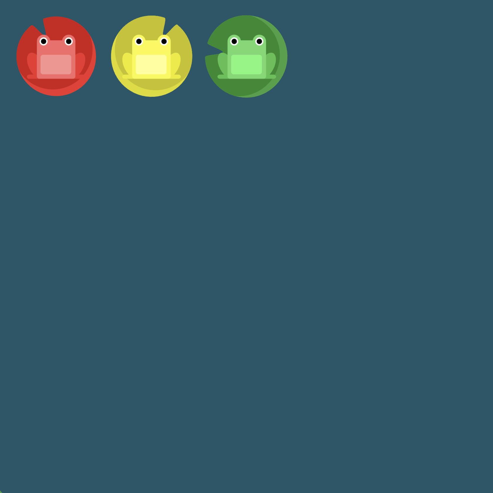
Solution
#pond {
    display: flex;              /* image 1 */
    justify-content: flex-end;  /* image 2 */
}

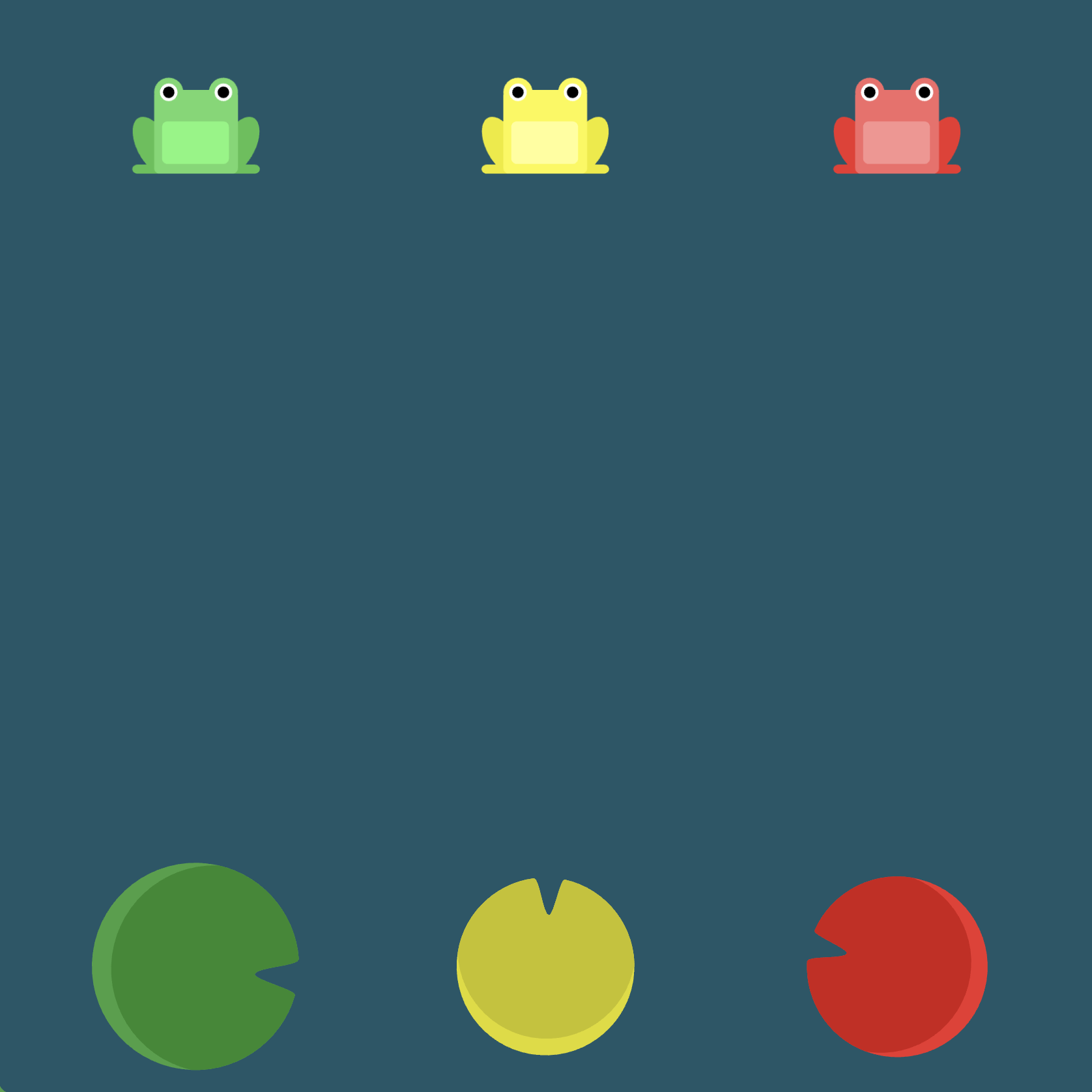
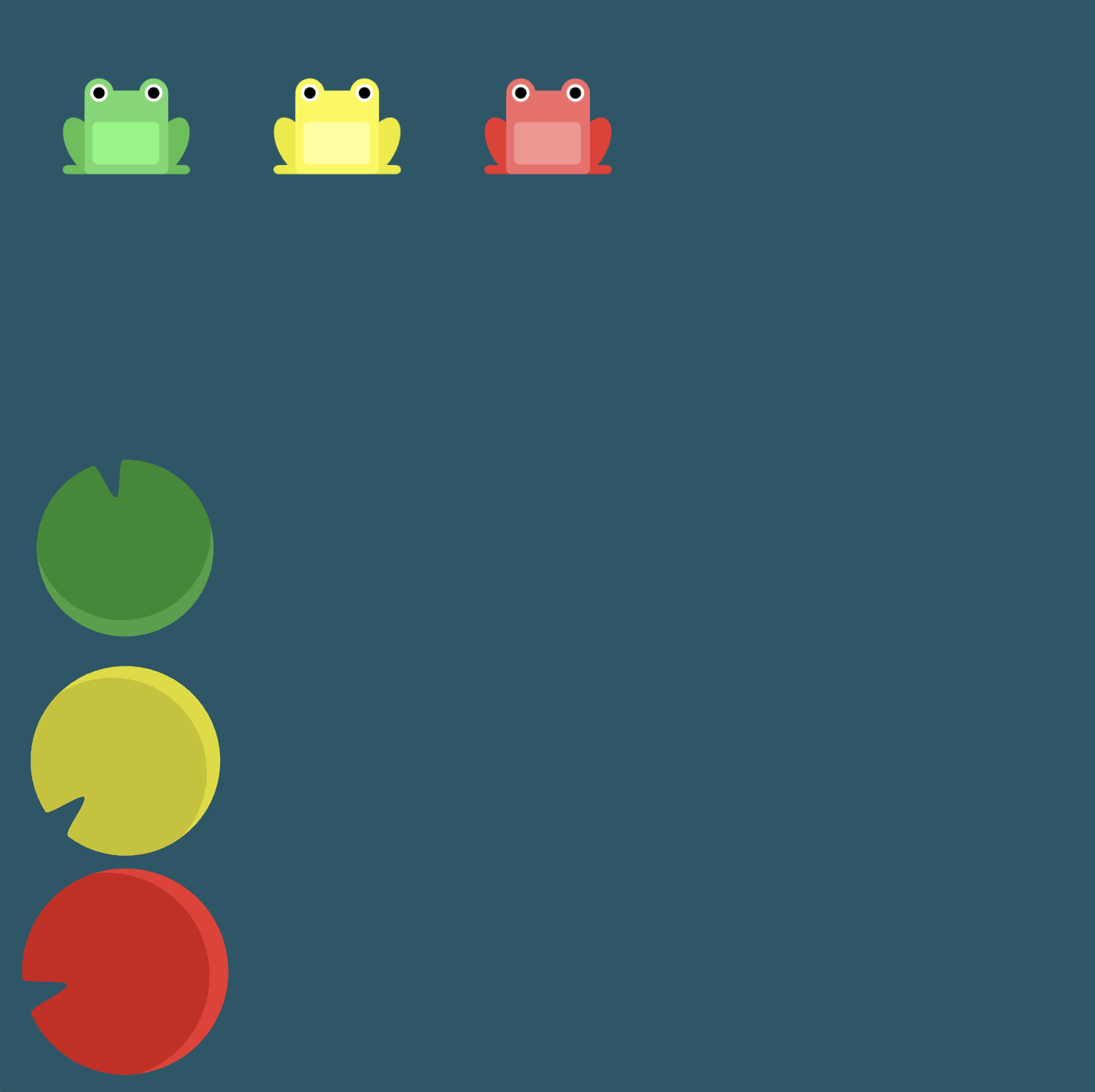
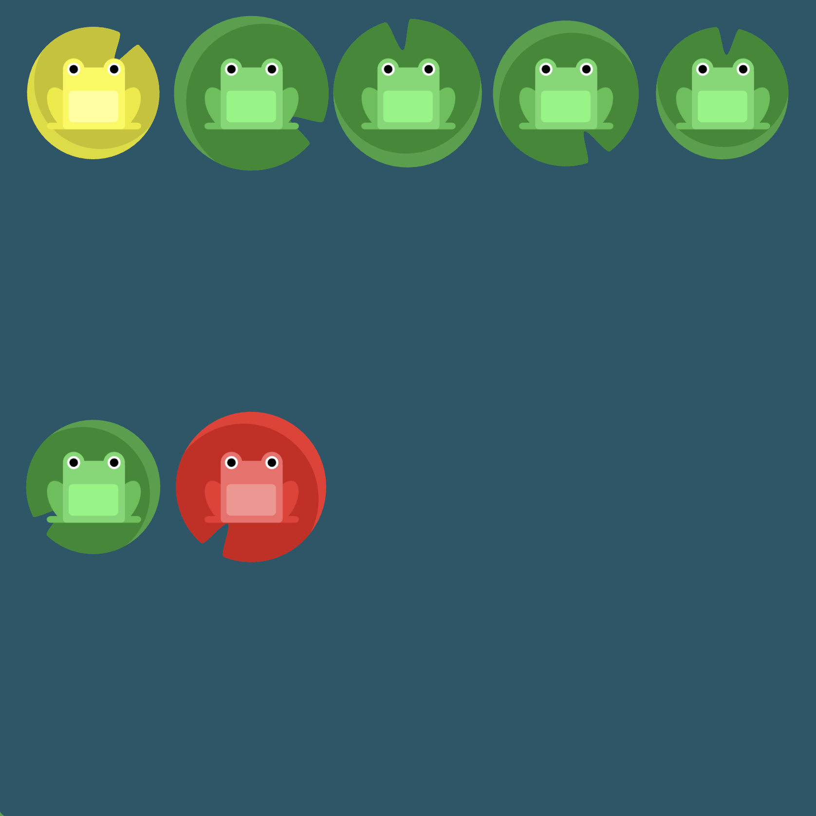
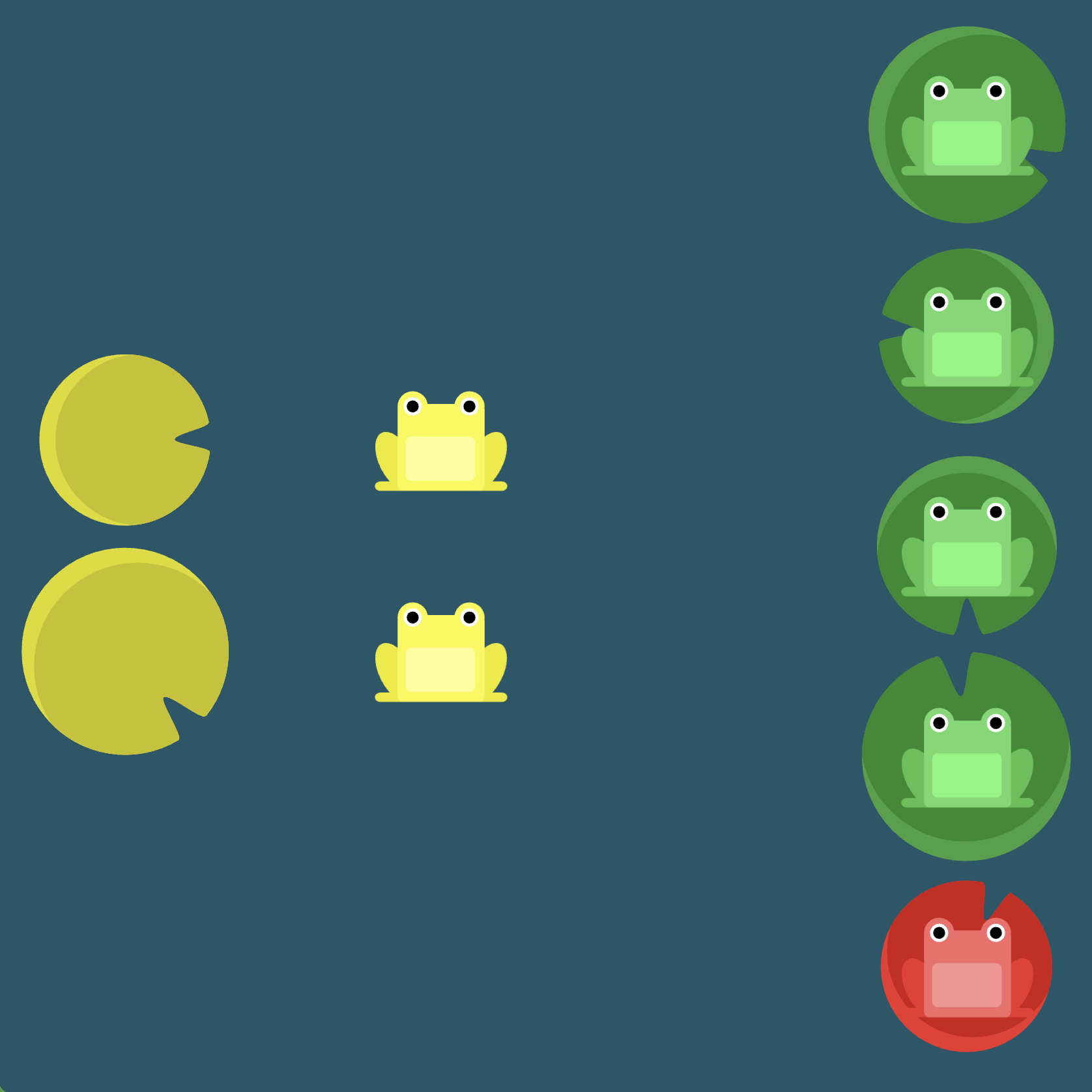
Level 2
Click here for more explicit directions (i.e., hints)
Recall that justify-content will center content along the main axis which is horizontal by default.

(See the flexbox properties and values for reference.)
/* given code */
#pond {
    display: flex;
                                            /* your work here */
    /* only use blank line above */
}
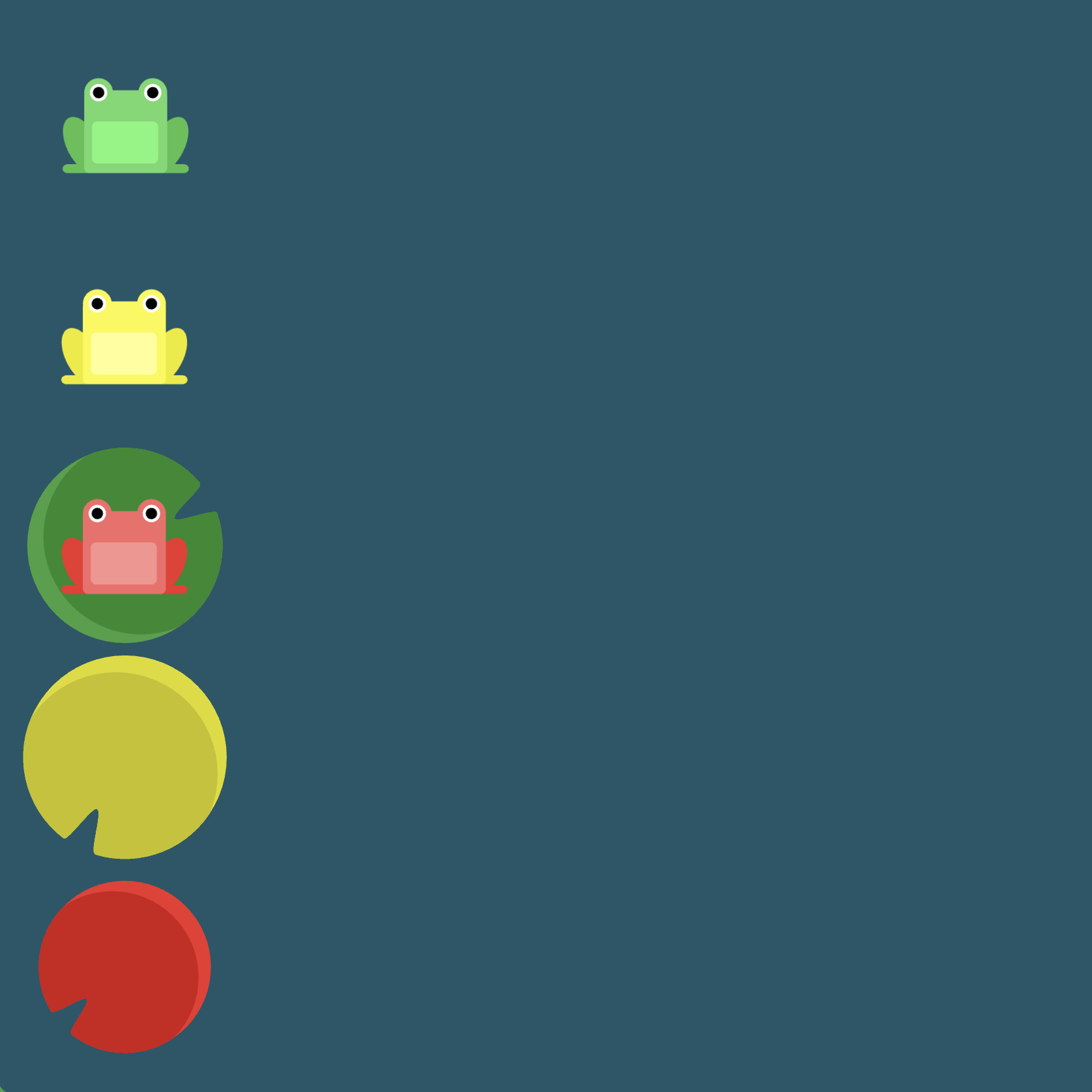
Solution
#pond {
    display: flex;            /* image 1 */
    justify-content: center;  /* image 2 */
}

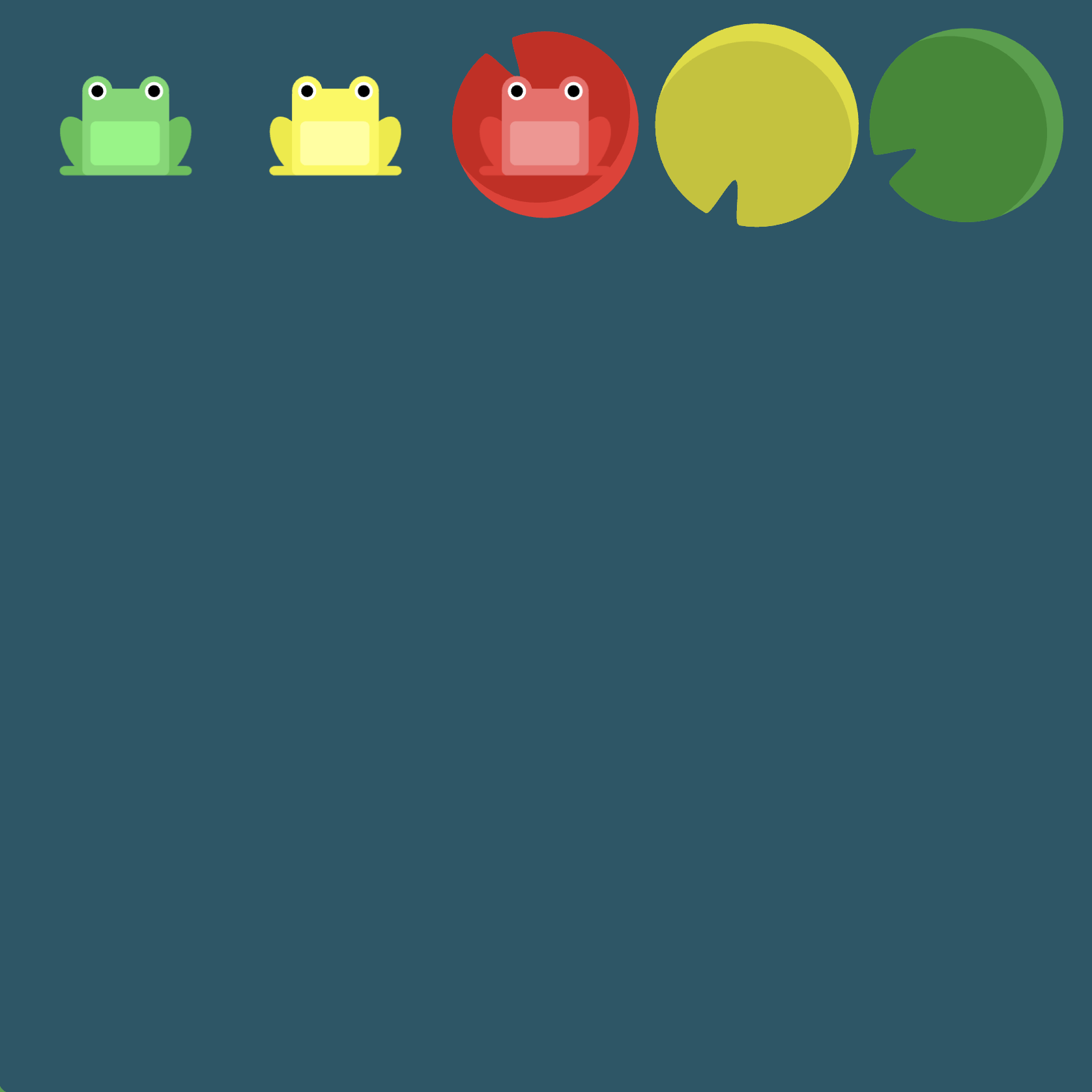
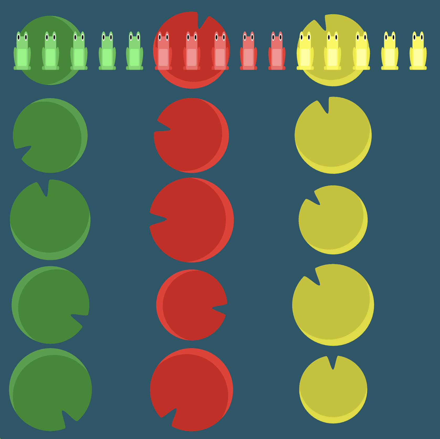
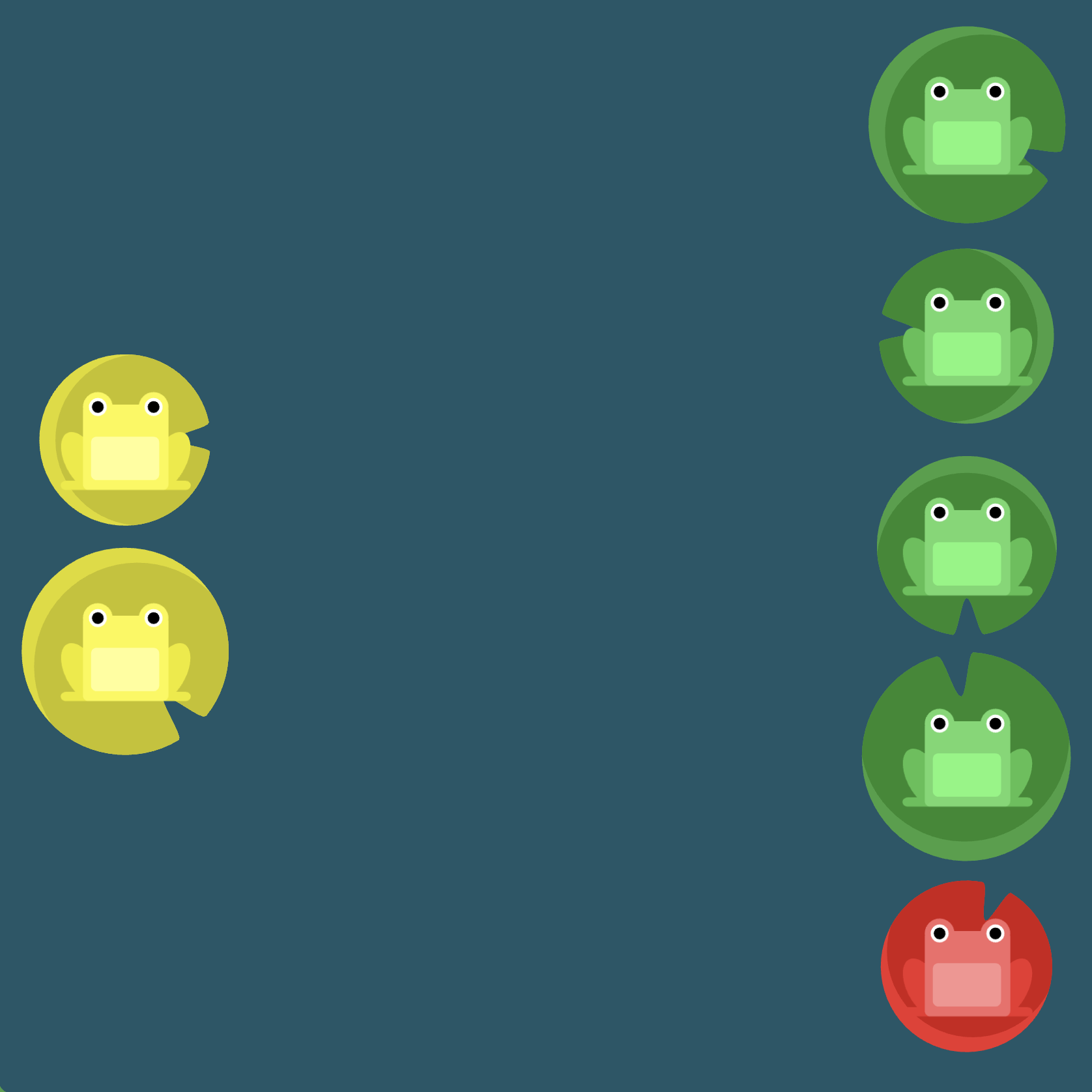
Level 3
Click here for more explicit directions (i.e., hints)
Recall that justify-content: space-between will produce equal spacing between items (this essentially means the elements on the outside extremes, or far left and far right, get pushed to the ends of the container) whereas justify-content: space-around produces equal spacing around the elements (including a sort of "wrapping" effect where side padding is taken into account between the item on the far left and the item on the far right).
(See the flexbox properties and values for reference.)
/* given code */
#pond {
    display: flex;
                                            /* your work here */
    /* only use blank line above */
}
Solution
#pond {
    display: flex;                  /* image 1 */
    justify-content: space-around;  /* image 2 */
}
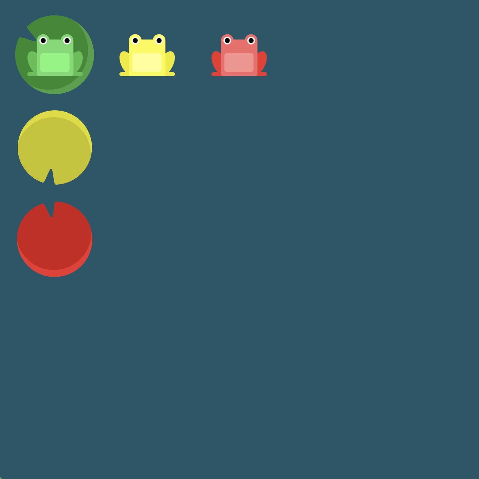
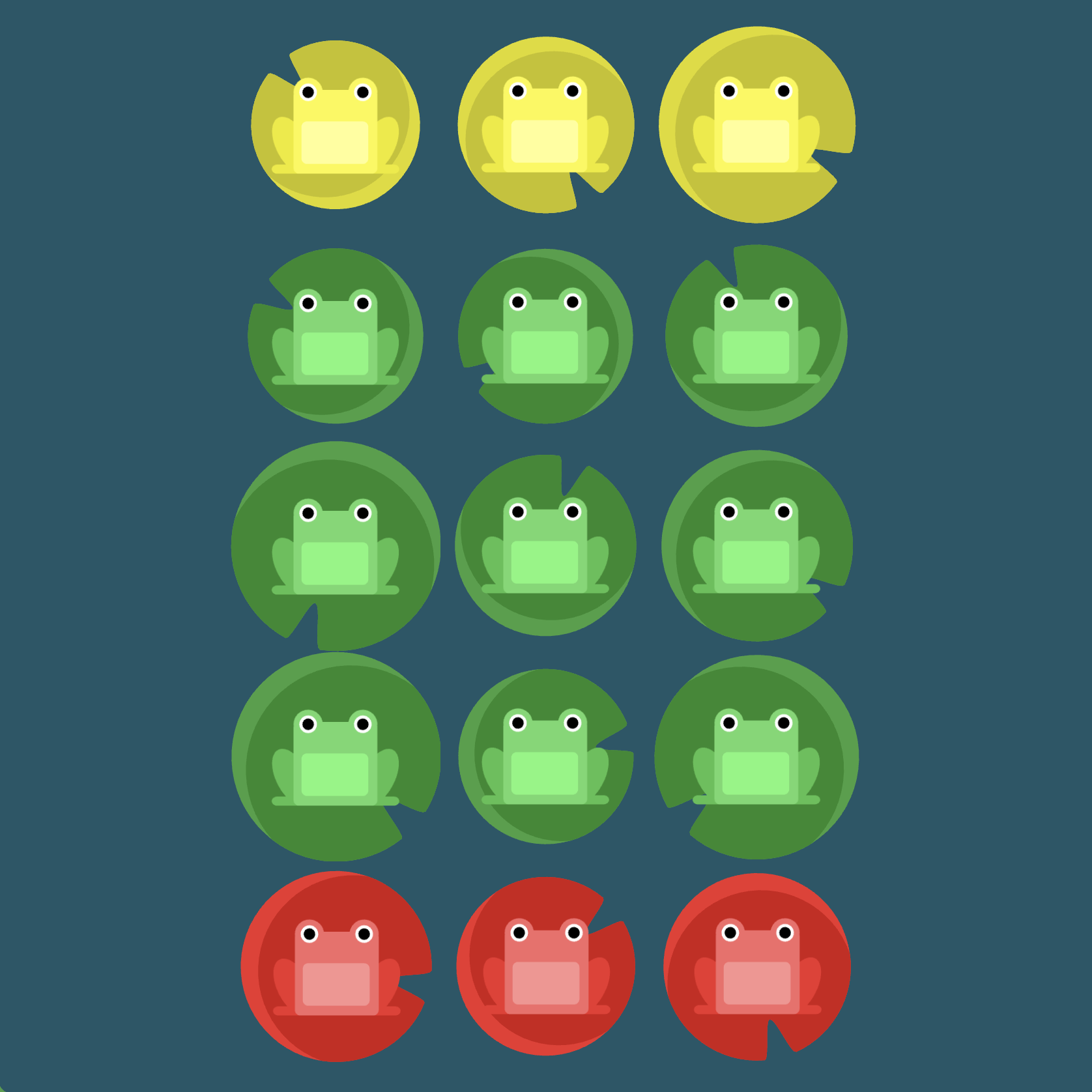
Level 4
Click here for more explicit directions (i.e., hints)
Recall that justify-content: space-between will produce equal spacing between items (this essentially means the elements on the outside extremes, or far left and far right, get pushed to the ends of the container) whereas justify-content: space-around produces equal spacing around the elements (including a sort of "wrapping" effect where side padding is taken into account between the item on the far left and the item on the far right).
(See the flexbox properties and values for reference.)
/* given code */
#pond {
    display: flex;
                                            /* your work here */
    /* only use blank line above */
}
Solution
#pond {
    display: flex;                      /* image 1 */
    justify-content: space-between;     /* image 2 */
}

Level 5
Click here for more explicit directions (i.e., hints)
What does align-items: flex-end seek to accomplish?
(See the flexbox properties and values for reference.)
/* given code */
#pond {
    display: flex;
                                            /* your work here */
    /* only use blank line above */
}
Solution
#pond {
    display: flex;              /* image 1 */
    align-items: flex-end;      /* image 2 */
}

Level 6
Click here for more explicit directions (i.e., hints)
Is it possible to accomplish the desired effect using justify-content and align-items?

(See the flexbox properties and values for reference.)
/* given code */
#pond {
    display: flex;
                                            /* your work here */
                                            /* your work here */
    /* only use blank lines above */
}
Solution
#pond {
    display: flex;              /* image 1 */
    justify-content: center;    /* image 2 */
    align-items: center;        /* image 3 */
}


Level 7
Click here for more explicit directions (i.e., hints)
Is it possible to accomplish the desired effect using justify-content and align-items?
(See the flexbox properties and values for reference.)
/* given code */
#pond {
    display: flex;
                                            /* your work here */
                                            /* your work here */
    /* only use blank lines above */
}
Solution
#pond {
    display: flex;                  /* image 1 */
    justify-content: space-around;  /* image 2 */
    align-items: flex-end;          /* image 3 */
}

Level 8
Click here for more explicit directions (i.e., hints)
Can you use flex-direction? What does flex-direction: row-reverse try to accomplish?
(See the flexbox properties and values for reference.)
/* given code */
#pond {
    display: flex;
                                            /* your work here */
    /* only use blank line above */
}
Solution
#pond {
    display: flex;                  /* image 1 */
    flex-direction: row-reverse;    /* image 2 */
}

Level 9
Click here for more explicit directions (i.e., hints)
Can you use flex-direction? What does flex-direction: column try to accomplish?
(See the flexbox properties and values for reference.)
/* given code */
#pond {
    display: flex;
                                            /* your work here */
    /* only use blank line above */
}
Solution
#pond {
    display: flex;              /* image 1 */
    flex-direction: column;     /* image 2 */
}

Level 10
Click here for more explicit directions (i.e., hints)
Is it possible to accomplish the desired effect using flex-direction and justify-content? Notice that when you set the direction to a reversed row or column, start and end are also reversed.

(See the flexbox properties and values for reference.)
/* given code */
#pond {
    display: flex;
                                            /* your work here */
                                            /* your work here */
    /* only use blank lines above */
}
Solution
#pond {
    display: flex;                  /* image 1 */
    flex-direction: row-reverse;    /* image 2 */
    justify-content: flex-end;      /* image 3 */
}
Level 11
Click here for more explicit directions (i.e., hints)
Can you accomplish the desired effect using flex-direction and justify-content? Notice that when the flex direction is a column, the main and cross axes switch; that is, justify-content changes to the vertical axis and align-items to the horizontal axis.
(See the flexbox properties and values for reference.)
/* given code */
#pond {
    display: flex;
                                            /* your work here */
                                            /* your work here */
    /* only use blank lines above */
}
Solution
#pond {
    display: flex;              /* image 1 */
    flex-direction: column;     /* image 2 */
    justify-content: flex-end;  /* image 3 */
}

Level 12
Click here for more explicit directions (i.e., hints)
Can you use flex-direction and justify-content to accomplish the desired effect?
(See the flexbox properties and values for reference.)
/* given code */
#pond {
    display: flex;
                                            /* your work here */
                                            /* your work here */
    /* only use blank lines above */
}
Solution
#pond {
    display: flex;                      /* image 1 */
    flex-direction: column-reverse;     /* image 2 */
    justify-content: space-between;     /* image 3 */
}

Level 13
Click here for more explicit directions (i.e., hints)
Can you use a combination of flex-direction, justify-content, and align-items to accomplish the desired effect?
(See the flexbox properties and values for reference.)
/* given code */
#pond {
    display: flex;
                                            /* your work here */
                                            /* your work here */
                                            /* your work here */
    /* only use blank lines above */
}
Solution
#pond {
    display: flex;                  /* image 1 */
    flex-direction: row-reverse;    /* image 2 */
    justify-content: center;        /* image 3 */
    align-items: flex-end;          /* image 4 */
}
Level 14
Click here for more explicit directions (i.e., hints)
Can you use the order property to accomplish the desired effect? Sometimes simply reversing the row or column order of a container is not enough. In these cases, we can apply the order property to individual items. By default, items have a value of 0, but we can use this property to also set it to a positive or negative integer value (..., -2, -1, 0, 1, 2, ...).

(See the flexbox properties and values for reference.)
/* given code */
#pond {
    display: flex;
}

.yellow {
                                            /* your work here */
    /* only use blank line above */
}
Solution
#pond {
    display: flex;  /* image 1 */
}

.yellow {
    order: 1;       /* image 2 */
}

Level 15
Click here for more explicit directions (i.e., hints)
Can you use the order property to accomplish the desired effect (remember that items have a default order value of 0)?
(See the flexbox properties and values for reference.)
/* given code */
#pond {
    display: flex;
}

.red {
                                            /* your work here */
    /* only use blank line above */
}
Solution
#pond {
    display: flex;  /* image 1 */
}

.red {
    order: -1;      /* image 2 */
}
Level 16
Click here for more explicit directions (i.e., hints)
Can you use align-self to accomplish the desired effect?
(See the flexbox properties and values for reference.)
/* given code */
#pond {
    display: flex;
    align-items: flex-start;
}

.yellow {
                                            /* your work here */
    /* only use blank line above */
}
Solution
#pond {
    display: flex;
    align-items: flex-start;    /* image 1 */
}

.yellow {
    align-self: flex-end;       /* image 2 */
}

Level 17
Click here for more explicit directions (i.e., hints)
Can you use order and align-self to accomplish the desired effect?
(See the flexbox properties and values for reference.)
/* given code */
#pond {
    display: flex;
    align-items: flex-start;
}

.yellow {
                                            /* your work here */
                                            /* your work here */
    /* only use blank lines above */
}
Solution
#pond {
    display: flex;
    align-items: flex-start;    /* image 1 */
}

.yellow {
    order: 1;                   /* image 2 */
    align-self: flex-end;       /* image 3 */
}
Level 18
Click here for more explicit directions (i.e., hints)
Can you use flex-wrap to accomplish the desired effect?
(See the flexbox properties and values for reference.)
/* given code */
#pond {
    display: flex;
                                            /* your work here */
    /* only use blank line above */
}
Solution
#pond {
    display: flex;      /* image 1 */
    flex-wrap: wrap;    /* image 2 */
}
Level 19
Click here for more explicit directions (i.e., hints)
Can you use flex-direction and flex-wrap to accomplish the desired effect? What about being even more concise and using flex-flow?
(See the flexbox properties and values for reference.)
/* given code */
#pond {
    display: flex;
                                            /* your work here */
                                            /* your work here */
    /* only use blank lines above */
}
Solution
#pond {
    display: flex;              /* image 1 */
    flex-direction: column;     /* image 2 */
    flex-wrap: wrap;            /* image 3 */
}
Note that we can accomplish the above using flex-flow, namely flex-flow: column wrap.
Level 20
Click here for more explicit directions (i.e., hints)
Can you use the flex-flow shorthand property by itself instead of both flex-direction and flex-wrap to accomplish the desired effect?
(See the flexbox properties and values for reference.)
/* given code */
#pond {
    display: flex;
                                            /* your work here */
    /* only use blank line above */
}
Solution
#pond {
    display: flex;              /* image 1 */
    flex-flow: column wrap;     /* image 2 */
}
Level 21
Click here for more explicit directions (i.e., hints)
Can you use align-content to accomplish the desired effect?
(See the flexbox properties and values for reference.)
/* given code */
#pond {
    display: flex;
    flex-wrap: wrap;
                                            /* your work here */
    /* only use blank line above */
}
Solution
#pond {
    display: flex;
    flex-wrap: wrap;            /* image 1 */
    align-content: flex-start;  /* image 2 */
}
Level 22
Click here for more explicit directions (i.e., hints)
Can you use align-content to accomplish the desired effect?
(See the flexbox properties and values for reference.)
/* given code */
#pond {
    display: flex;
    flex-wrap: wrap;
                                            /* your work here */
    /* only use blank line above */
}
Solution
/* given code */
#pond {
    display: flex;
    flex-wrap: wrap;        /* image 1 */
align-content: flex-end;    /* image 2 */
}
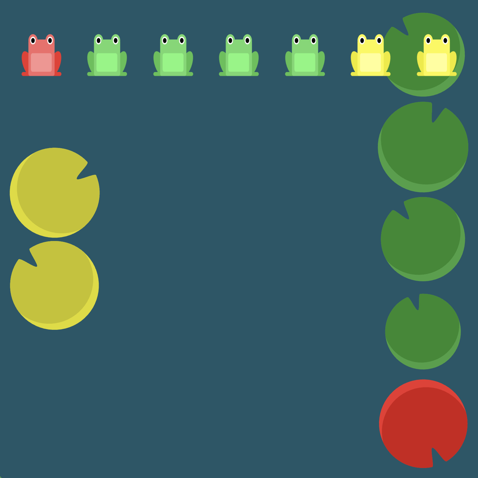
Level 23
Click here for more explicit directions (i.e., hints)
Can you use flex-direction and align-content to accomplish the desired effect?
(See the flexbox properties and values for reference.)
/* given code */
#pond {
    display: flex;
    flex-wrap: wrap;
                                            /* your work here */
                                            /* your work here */
    /* only use blank lines above */
}
Solution
#pond {
    display: flex;
    flex-wrap: wrap;                    /* image 1 */
    flex-direction: column-reverse;     /* image 2 */
    align-content: center;              /* image 3 */
}
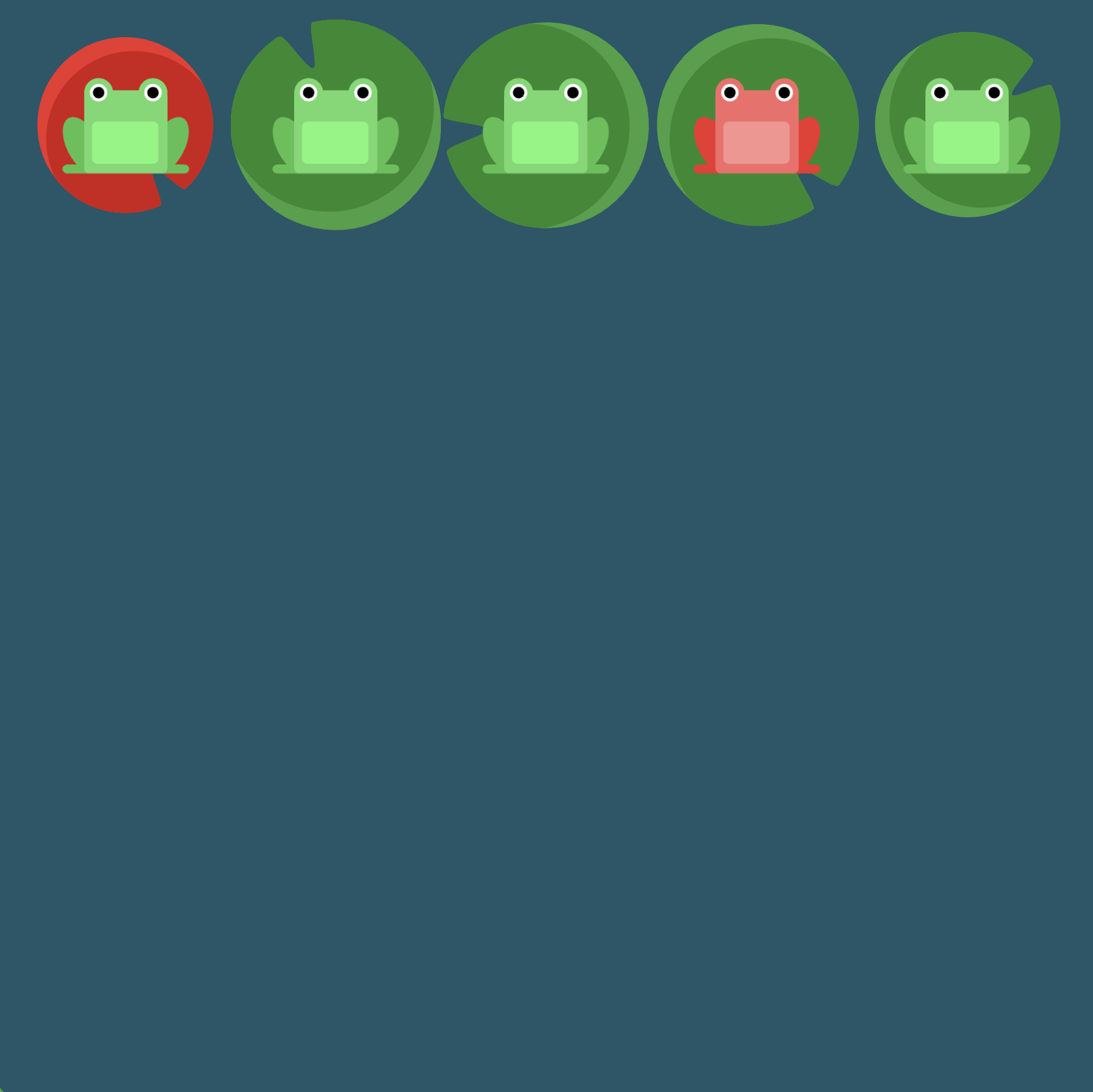
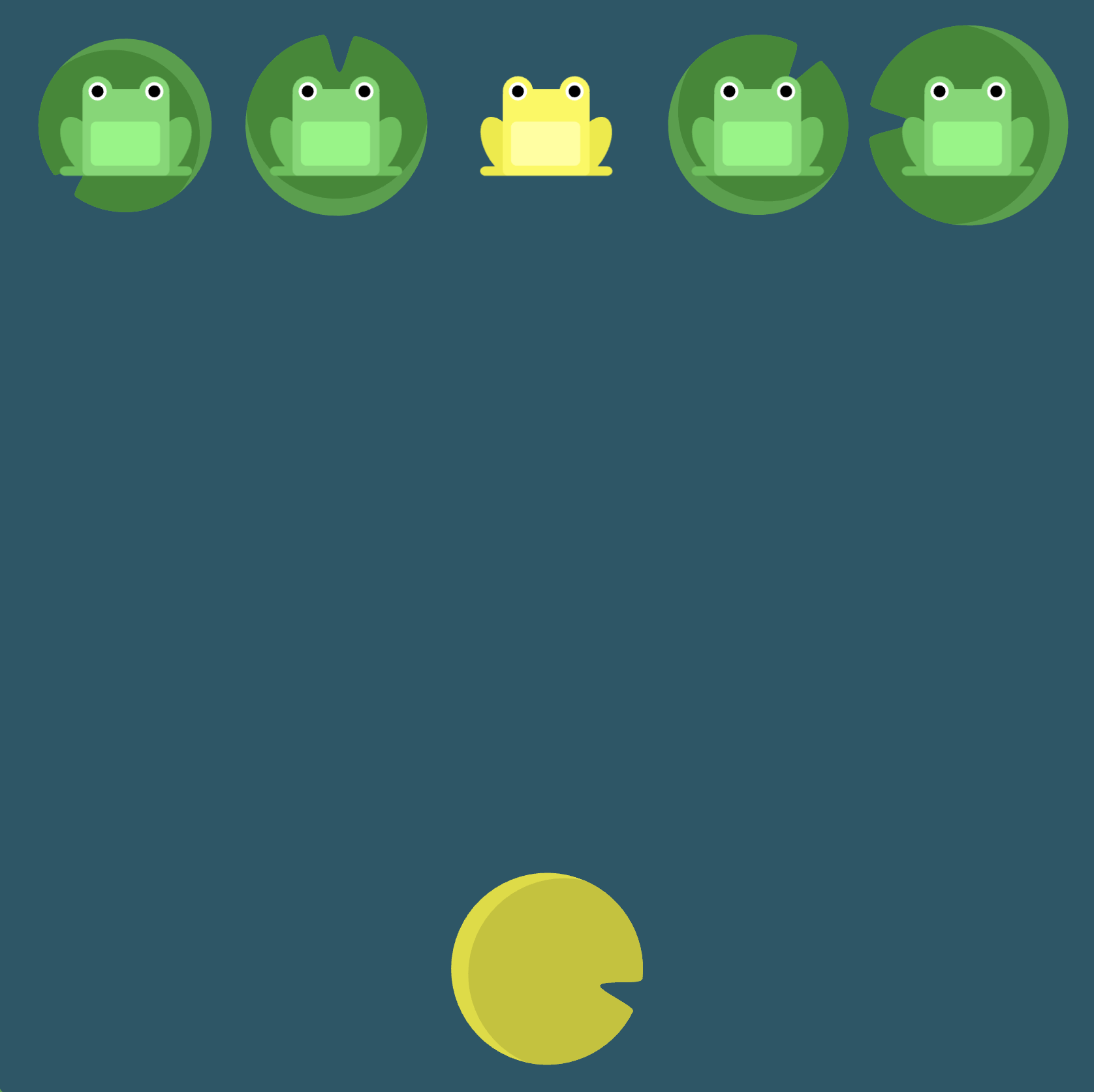
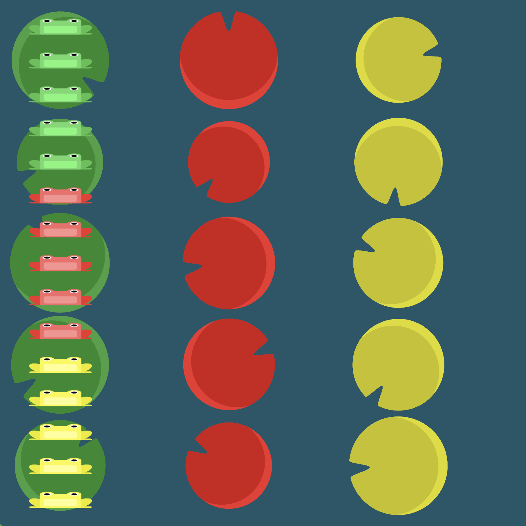
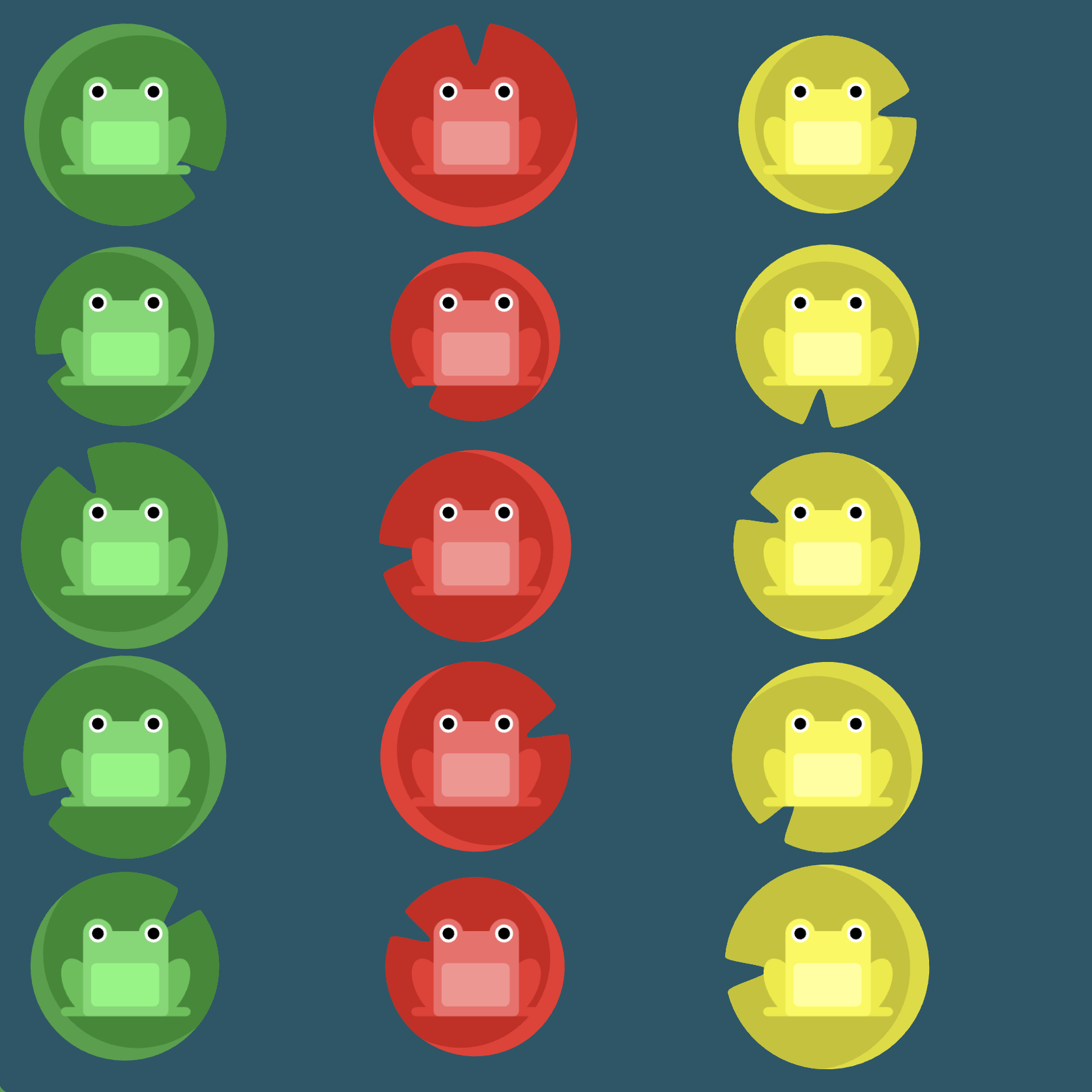
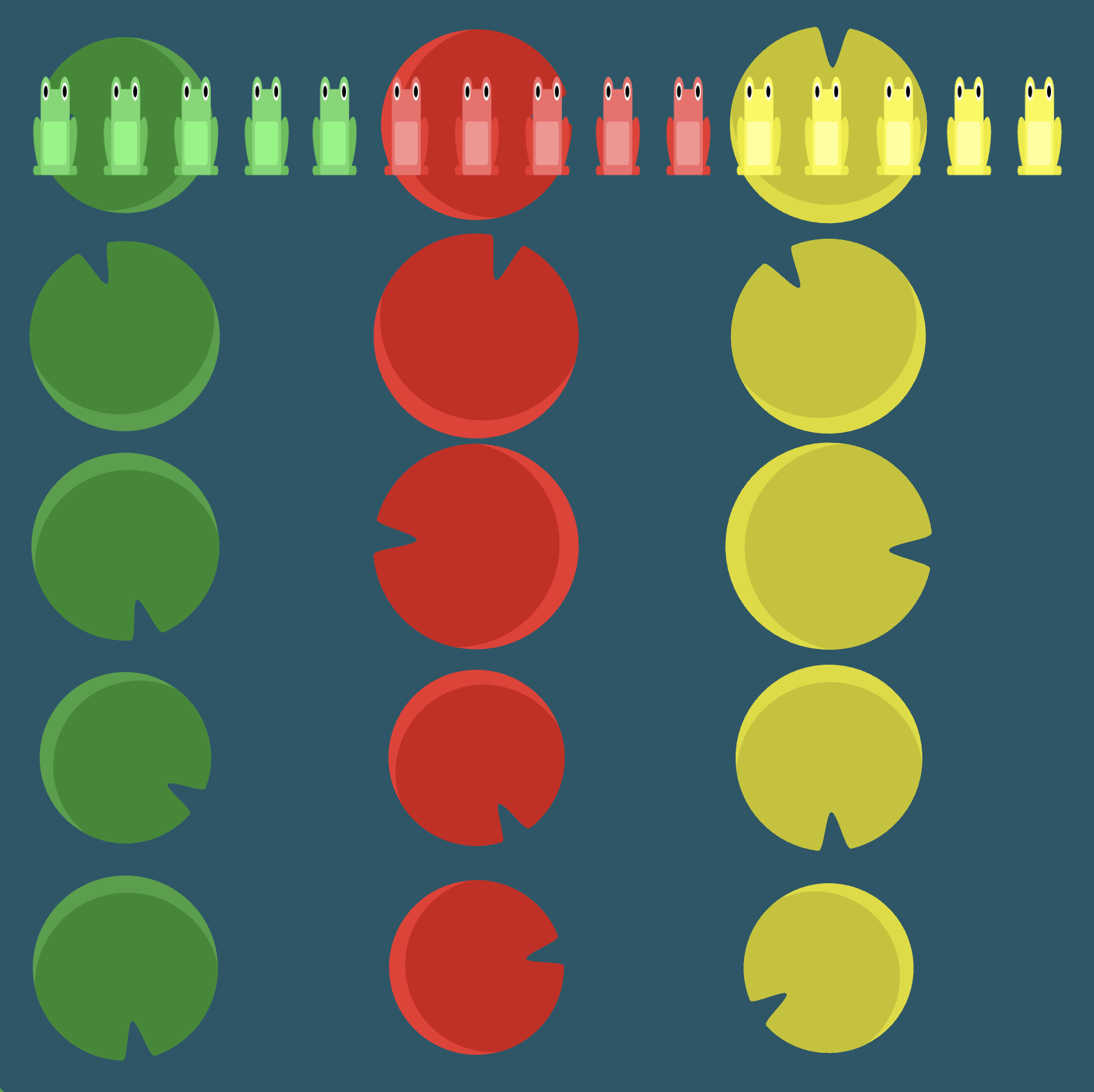
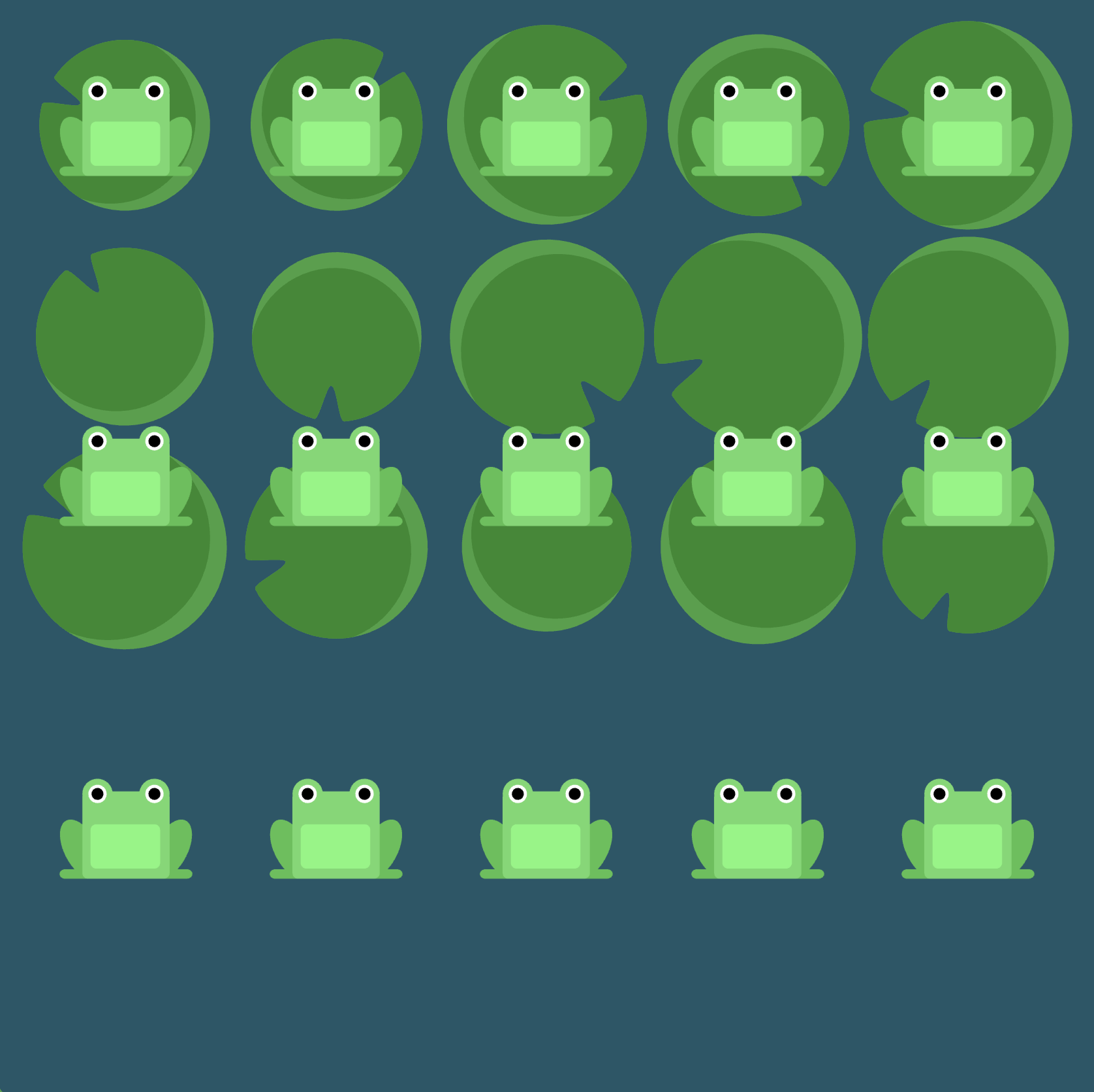
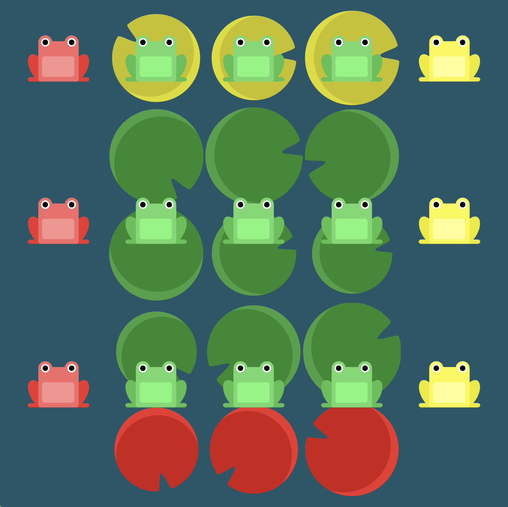
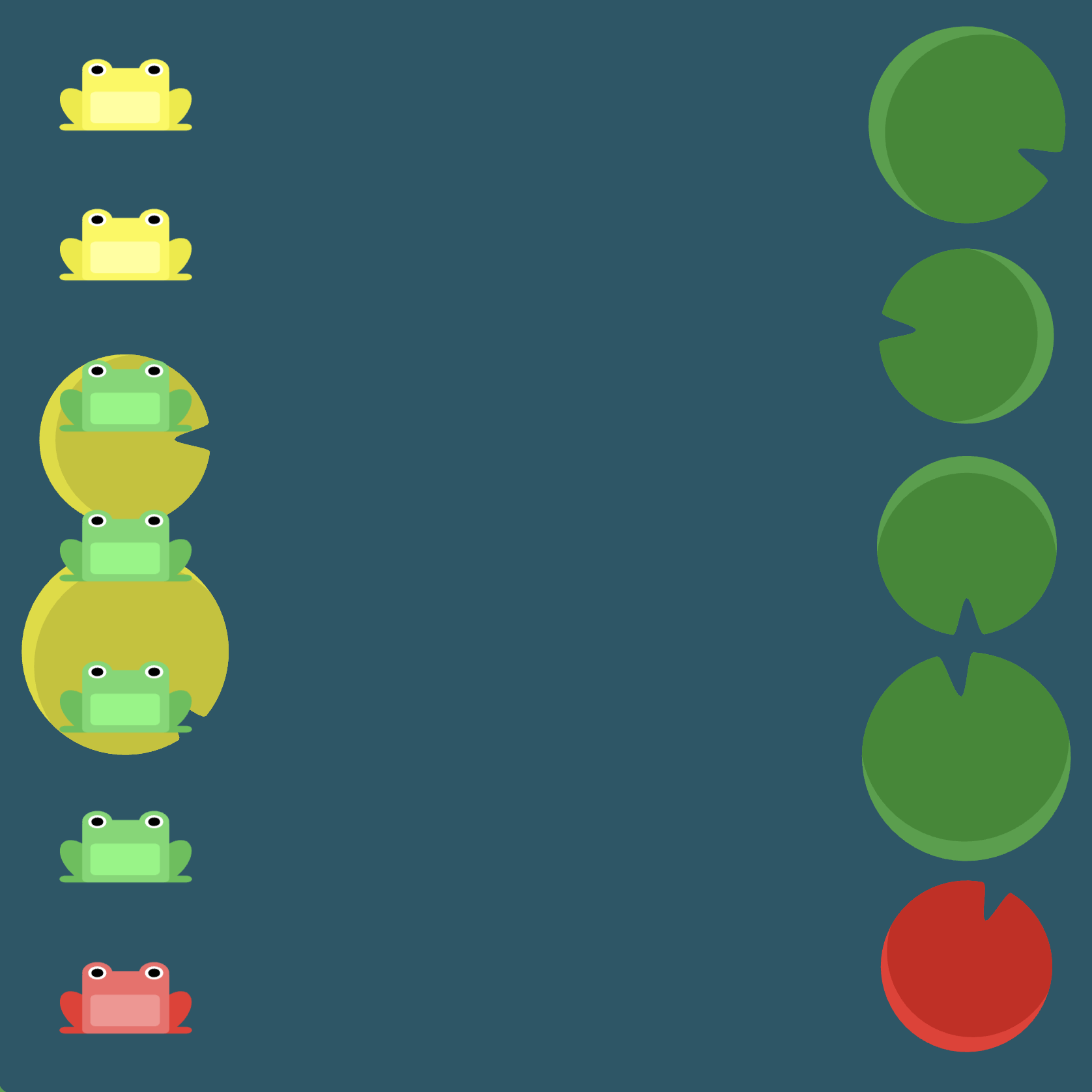
Level 24
Click here for more explicit directions (i.e., hints)
Hint 1 (somewhat vague)
Can you use some combination of flex-direction, flex-wrap, justify-content, and align-content to accomplish the desired effect (recall that flex-direction and flex-wrap can be combined into one property with flex-flow)?
Hint 2 (terribly specific, basically the answer)
Would flex-direction: column-reverse be helpful? What about flex-wrap: wrap-reverse? Now it's mostly a matter of having our axes sorted correctly. Would justify-content: center help us get the yellow frogs centered vertically? If so, would align-content: space-between then help us place the yellow frogs on their lily pads?
(See the flexbox properties and values for reference.)
/* given code */
#pond {
    display: flex;
                                            /* your work here */
                                            /* your work here */
                                            /* your work here */
                                            /* your work here */
    /* only use blank lines above */
}
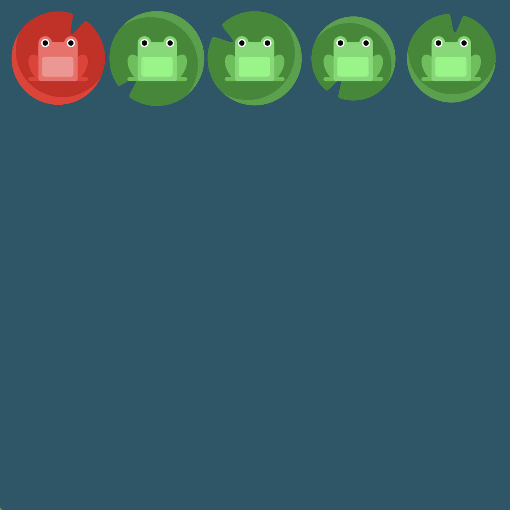
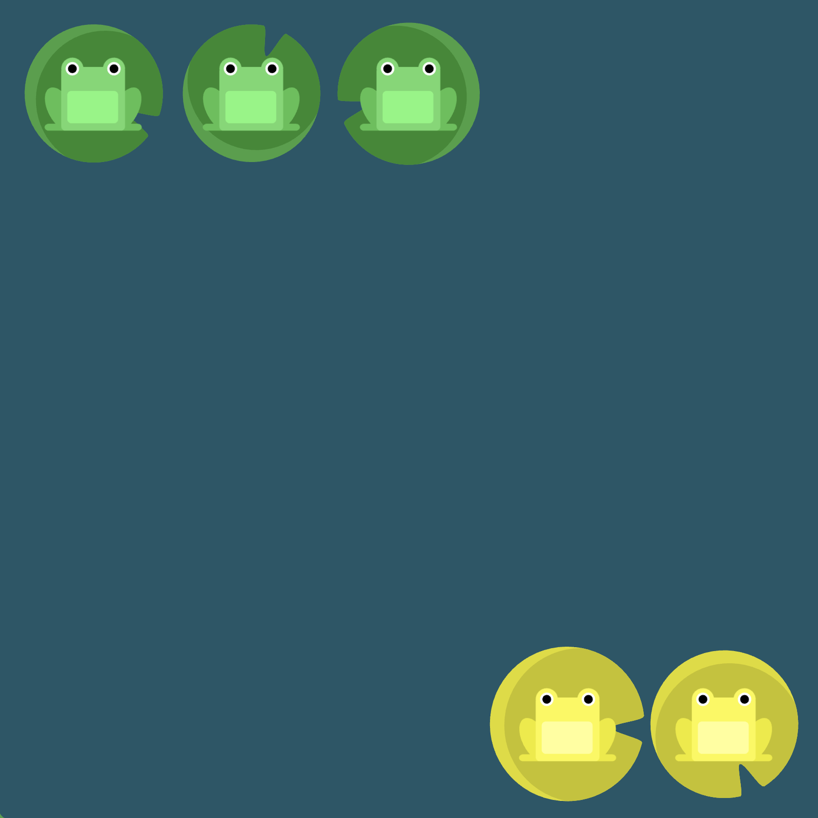
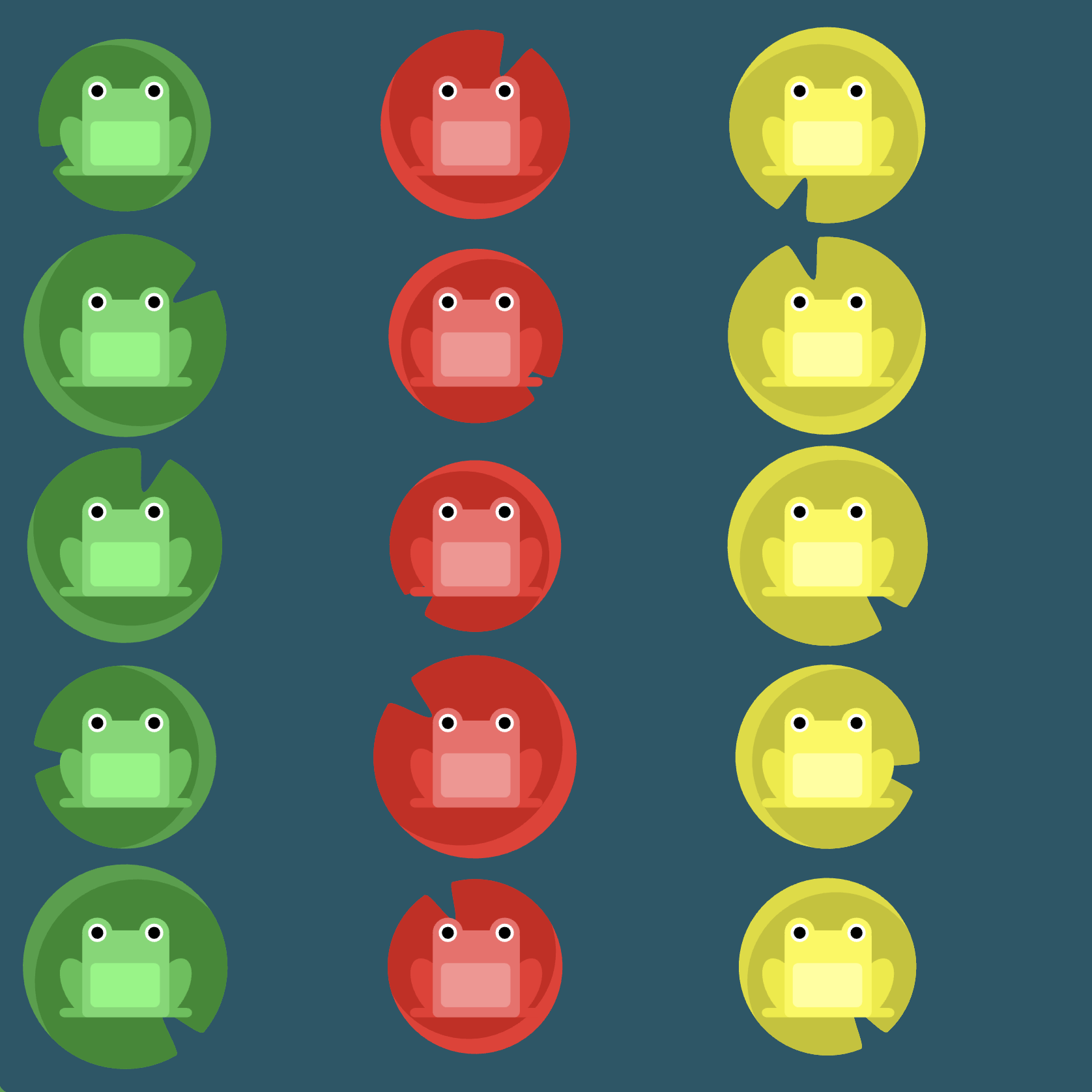
Solution
#pond {
    display: flex;                      /* image 1 */
    flex-direction: column-reverse;     /* image 2 */
    flex-wrap: wrap-reverse;            /* image 3 */
    justify-content: center;            /* image 4 */
    align-content: space-between;       /* image 5 */
}
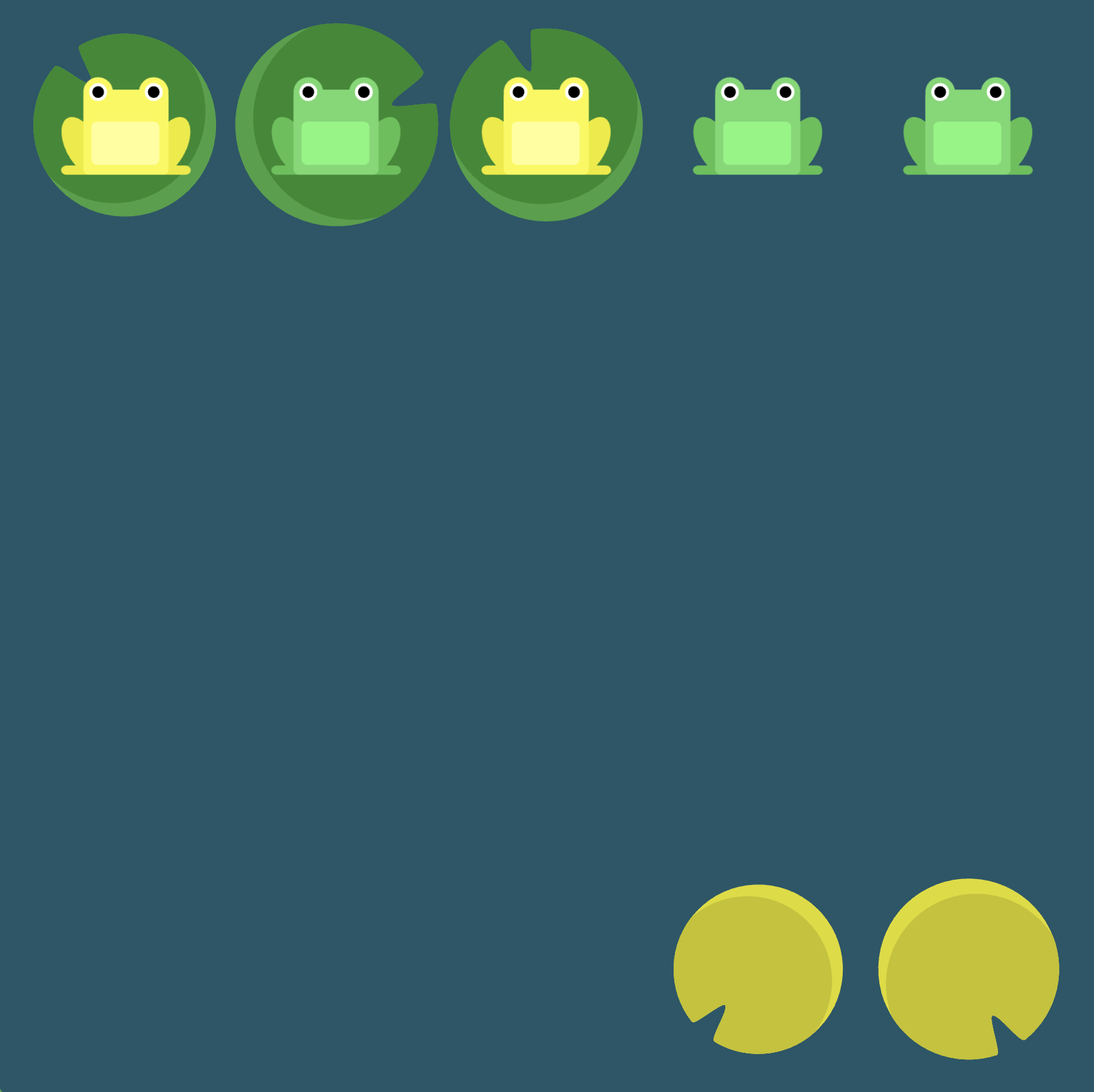
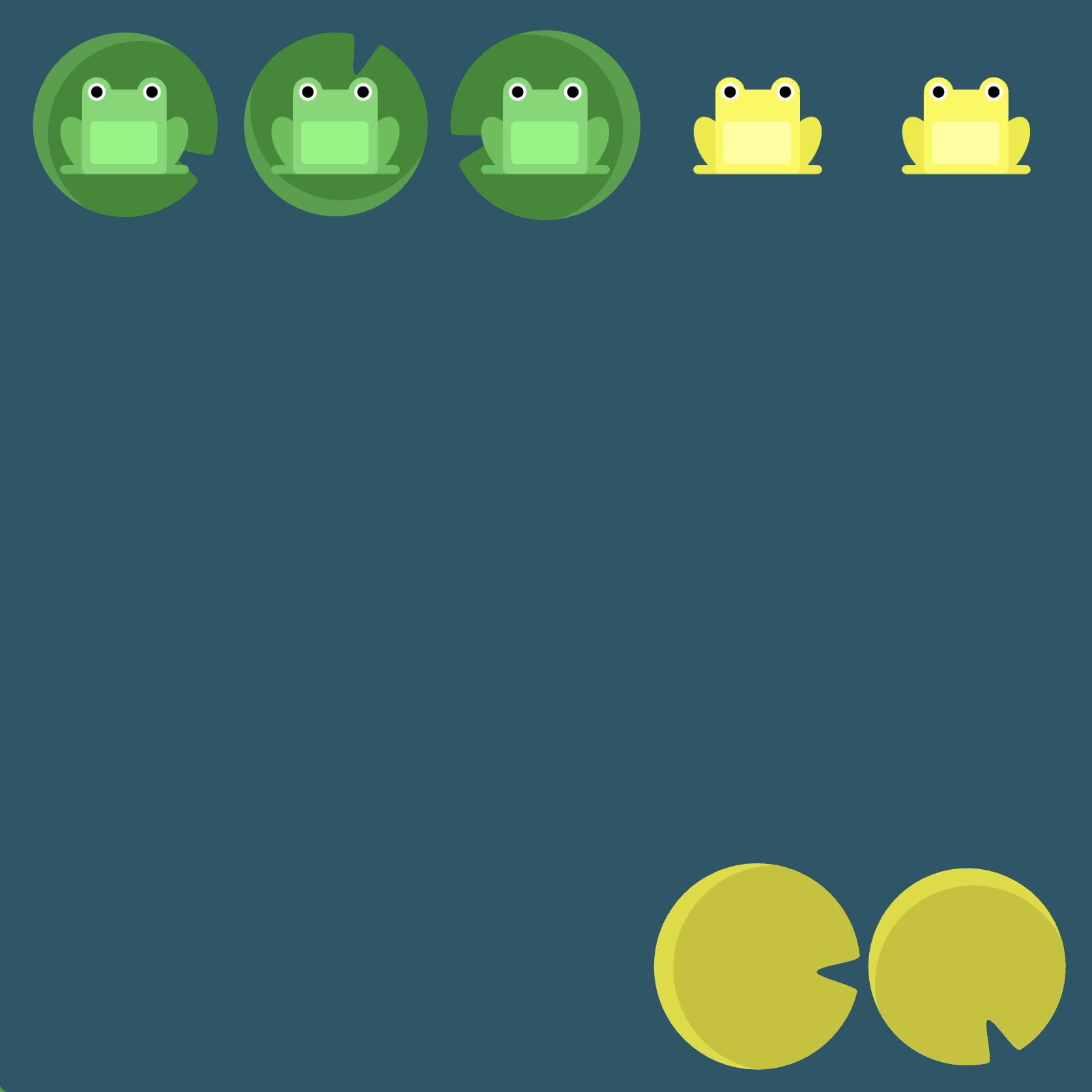
Note: Each decision in the solution was reached via the following "thought process":
flex-direction: column-reverse: The lilypads are arranged vertically. This first suggests that the frogs need to be aligned vertically (i.e., we should probably have something likeflex-direction: column). Additionally, the red lilypad is at the bottom while the red frog is at the top. This suggests that we should reverse the ordering of the column (i.e.,flex-direction: column-reverse).flex-wrap: wrap-reverse: We now want to right-align the frogs and have proper vertical spacing. We almost get this withflex-wrap: wrap, but the red and green frogs need to be on the right instead of the left. The solution is to reverse the wrap (i.e.,flex-wrap: wrap-reverse).justify-content: center:The yellow frogs need to be centered vertically and then moved to the left. Normally we would usealign-content: centerto center flex items vertically, but recall that we swapped the axes by usingflex-direction: column-reverse. Thus, the solution is to actually usejustify-content: centersince now the vertical axis is the main axis.align-content: space-between: We now need the yellow frogs to be pushed all the way to left. More specifically, we need to have equal space between the yellow frogs and the other frogs. This leads us to usealign-content: space-between.
Final note: since flex-flow incorporates both flex-direction as well as flex-wrap, we can actually refactor our code to be slightly more concise:
#pond {
    display: flex;                              /* image 1 */
    flex-flow: column-reverse wrap-reverse;     /* images 2 and 3 *
    justify-content: center;                    /* image 4 */
    align-content: space-between;               /* image 5 */
}